Rebekah Terry
UI/UX Designer. Illustrator.
EB - Lesson Redesign
As a former teacher with a Master’s in Education, my designs for Encyclopedia Britannica were driven by pedagogical best practices. They go beyond being user-friendly and innovative—they are intentionally crafted to support teachers and enhance student learning.
Project Overview:
Expedition Learn is an upcoming educational product from Encyclopedia Britannica focused on Social Studies and Science for grades 1-8. Each 11-page lesson covers a specific topic:
• Page 1: Spark video to introduce the topic and a question for written response.
• Pages 2-5: Articles with accompanying media, followed by progressively challenging questions.
• Pages 6-10: Additional questions exploring key ideas.
• Page 11: Supplementary resources and related lessons.
Objective:
This redesign aimed to boost user engagement and improve usability, prioritizing educational impact for both students and teachers.
Sales Dashboard
Client:
J. Hilburn
Design Task:
Create an intuitive mockup for a Title Progress widget that addresses the following stylist concerns:
Lack of full visibility into title requirements, particularly when a Stylist aims to advance 2-3 ranks.
The current widget isn't engaging or motivating enough to inspire stylists to take action.
The widget should clearly communicate daily goals to help stylists understand exactly what they need to do to progress.
Analytics Dashboard
Note: As a former teacher with a Master's in Education, all of my designs for Encyclopedia Britannica were driven by pedagogical best practices. Simply put, they aren't just user-friendly, intuitive, and innovative. They are also purposefully created in a way to make the lives of teacher's easier, and to engage and help students learn.
Overview: For a recent EB educational product, I designed an analytics dashboard for school administrators to track usage and performance across schools, teachers, and students. I collaborated with a Project Manager, front and back end developers, and an SME. While the PM and SME set user goals and some requirements, I led the design, direction, and research. To inform the design, I analyzed user survey responses, behavioral data, and trends from our educational products, researched competitors and user needs in EdTech, and drew on my own teaching experience with data analysis.
Engage Reading Feature
Note: As a former teacher with a Master's in Education, all of my designs for Encyclopedia Britannica were driven by pedagogical best practices. Simply put, they aren't just user-friendly, intuitive, and innovative. They are also purposefully created in a way to make the lives of teacher's easier, and to engage and help students learn.
Overview: This is a reading tool prototype I designed, but which was never used, with the intention to increase student reading engagement. Please watch the video for the full explanation and features walk-through. What I refer to as the "Engage" feature, is a tool I created which requires students to turn the subheadings into questions and then answer those questions with evidence from the text. This tool takes students step-by-step to find the main idea of each section and record their answers. In the educational world this is referred to as the SQRRR method, and is used to teach informational texts. Here, I have digitized it.
Deka
Overview
Deka, from the Greek word for “ten,” provides great recommendations to the user, wherever they may be. Specifically, it gives them the Top 10 Recommendations, for whatever they require, whether it’s the best Thai Food Restaurants, the Top Things to Do in a City, the Top Ten Concerts, etc. Using Hick’s Law, Deka aims to limit the amount of choices the user has so they aren’t overwhelmed by sifting through reviews, but can instead rely on Deka’s recommenders to provide them the best of the best. Not only does it provide reviews for multiple categories in multiple cities, it also shows the locations of the places, provides the user the ability to navigate to their chosen recommendations, favorite recommendations for the future, and write reviews.
Purpose and Context
This project was created for class. The design brief was to create a location-based recommendation app. I looked at several existing apps, including Yelp, Google Reviews, and TripAdvisor, and one thing I noticed was that they all depended on masses of reviews, but also that there were some inherent biases built into this review process. Older listings continued to be seen first and reviewed more often because they had more hits because they had been around longer, not necessarily because they were the best. Also, users would get frustrated and experience fatigue by reading multiple conflicting reviews from users who had wonderful experiences, and others who had terrible experiences.
Objective
My objective was to simplify this search process, and eliminate user fatigue. Instead of forcing users to sift through dozens of reviews and look at dozens of recommendations, I used Hick’s Law to limit their choices to the best, and the Top Ten in each category, more specifically. These ten would be selected by top experts or reviewers in each area.
Approach
I organized the home page similar to Tripadvisor, and sorted activities and restaurants accordingly. When a user selects a category it opens onto a map, similar to Google, and shows the locations of the recommendations. Users can click on the map pins to read more about each recommendation and take an action from there, whether it’s to buy a ticket or navigate to a restaurant or museum.
Challenge
This app was an earlier one I created, and so one of the biggest challenges was when I decided to go back and redesign it. Ultimately, it looked too similar to another app I had created. Also, I thought the design was a bit clunky, and I wanted to bring a beautiful bright feel, that of a sunrise (thus the gradient of colors from blue, purple, pink, and peach) which invoked travel, adventure, and new days full of new surprises. It took me a few weeks of intensive work to redesign it, but ultimately I’m so happy I did, and it taught me a lot about letting go of what doesn’t work in favor of what does.
Ami
Overview
Ami is a PRM (Personal Relationship Manager) App that helps the user to better maintain and keep in contact with the people in their lives who are most important to them. Similar to a CRM (Customer Relationship Manager), Ami stores information about your closest family, friends, and loved ones, gives reminders to contact them, and provides recommendations.
Purpose and Context
The purpose of Ami is to help bring people closer together and strengthen their communication. Inspired by CRMs that remind users to contact customers and that stores information about them, Ami makes it easy for users to keep in contact with and store information about the people in their lives who are closest to them.
Objective
To create an original app idea for my course, develop 4-5 functionalities and user flows, and create high-fidelity wireframes to demonstrate these user flowers.
Approach
Ami provides reminders to text, call, email, or video chat with your friends, family, and love interests. It even gives conversation starters and allows the user to text, call, or video chat directly from the contact’s profile. What about recommendations? The more Ami knows, the more it can recommend. If the user’s girlfriend Abby likes to hike, then Ami might recommend some of the best trails nearby. If Ami’s Uncle Jack loves craft beer, Ami might recommend taking him to a brewery, or buying him a new brew that he might like. The more the user interacts with Ami, the more their relationships grow, and this is also reflected in their contacts’ avatars, represented by plants, which also grow the more the user interacts with that contact.
Challenge
The challenge for this app was designing something new that I haven’t seen before on the market. Although I was inspired by CRMs, I wanted something fun as well as functional. When coming up with the ideas of avatars to represent the user’s contacts, I was reminded of Tamagotchis that thrive or decline based on the level of interaction. I thought if I could create something useful, that would help people maintain their communication with friends or family, coupled with recommendations for things to do, places to eat, and gift possibilities, as well as gamifying the experience with the growing plant avatars, that users would be intrigued and engaged.
Metta
Overview
Metta is a form of meditation so often overlooked. This type of meditation helps the user practice loving-kindness—towards themselves and others. Users can expand and deepen the love and kindness they have for themselves, or participate in other guided meditations. These meditations include Vipassana (mindfulness), or Zazen (sitting), with various guides and for different amounts of time depending on the user’s preferences and time constraints.
Purpose and Context
This project was created for class. In this scenario, I was meant to develop the first prototype of a meditation app. I was asked to design the 3-5 main app screens and integrate motion into them. My role was to develop motion concepts using storyboards, showcasing examples of 1) transitions between the screens and 2) screen-specific details like microinteractions. At the beginning of the project, I decided which core brand values should be expressed in the app, and provided the client with style fundamentals like the color scheme and fonts. I was also responsible for getting feedback from my team and creating a video presentation for project stakeholders.
Objective
My objective was to create an app that made the user feel calm, acceptance, and present in the moment. I wanted to showcase these values, as well as present an app that was easy to navigate and which met the requirements of my design brief.
Approach
The low fidelity wireframes were provided to me, but the animations and user interactions were left entirely up to me. I wanted the transitions and interactions to be a reflection of the values of the app. Everything should be smooth, gentle, and calming. The preloader, for example, was timed with the cadence of someone breathing in and out, as you would when you meditate.
Challenge
As this was my first solo project using After Effects, the challenge here was not only deciding what I wanted to do, but figuring out how to do it and if it was feasible and didn’t take away from the user’s experience. I approached this challenge by making sure to carefully storyboard the animations so I could better implement what I wanted to do and where.
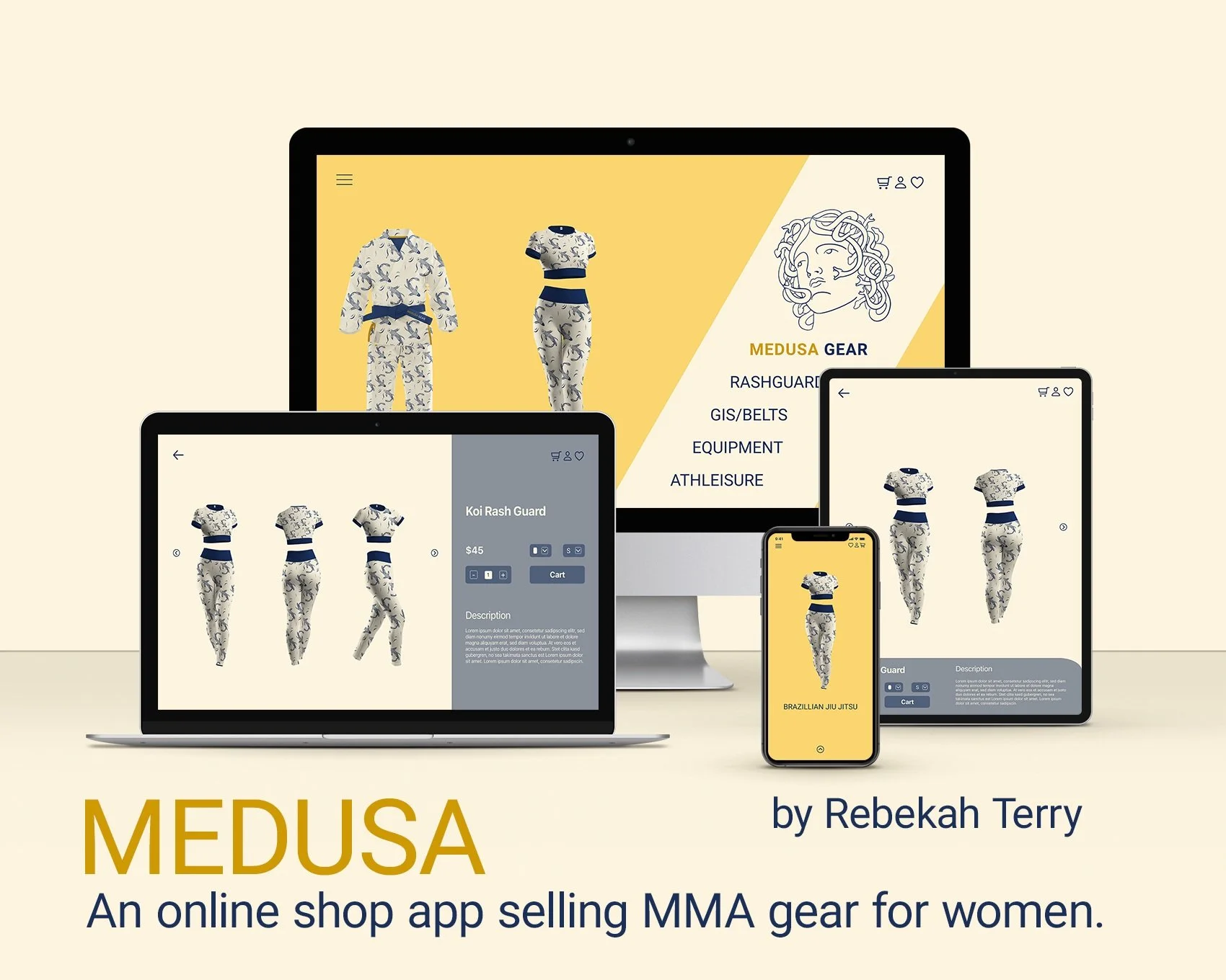
Medusa
Medusa Gear is an MMA clothing and supply store specifically geared toward women athletes. Medusa prides itself on producing high-quality gear with beautiful designs at an affordable price point. It strives to make shopping quick and easy, making it simple to add items to a cart or save them for later.
Thoughts
Overview
Thoughts is a minimal, straight-forward app that allows users to quickly and easily take notes, make checklists, store photos, and, in general, keep track of their thoughts. Its design is cute and fun, with lines drawn purposefully outside the note and checklist boundaries in order to visually promote outside-the-box ideas.
Purpose and Context
Thoughts, a notes and checklist app, was created for my course as an exercise in developing an app quickly and with a minimal brief. My only guidance was “a note-taking app à la “less, but better,” that it is shaped mostly by functionalism, and a delivery of high-fidelity wireframes for “5 screens so they can pitch the concept to their investors.”
Objective / Approach
Since there wasn’t much guidance on this project besides creating a note and checklist app that was simple, I took it upon myself to create the core functionalities of the app. So I created a homepage that makes it easy to see all the latest notes and checklists a user has created, easily add a new note or checklist, and easily search for and organize existing notes and checklists.
Challenge
The challenge for this app was speed, and I really enjoyed it. It forced me to simplify the process and really focus on the MVP, Minimum Viable Product, and what key functions the user would need to use and enjoy the app.
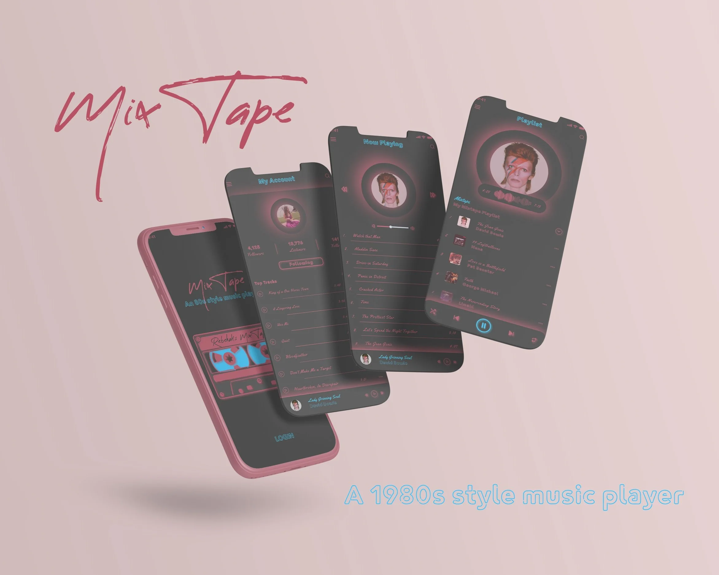
MixTape
Overview
MixTape is an 80s style music player app for 35-55 year olds. This was my first assignment for my UI program. The first few iterations of this app looked very amateurish, but this last version is something of which I’m proud. I wanted to invoke that neon look with bright pink and blue against a black backdrop. The frames I created show a Login Screen, an Account Screen with the top tracks the user has listened to, a “Now Playing” page that shows what the user is currently listening to, and the MixTape Playlist page that shows a custom MixTape made specifically for the user.
Purpose and Context
This project was created for class. The design brief was simple: an 80s style music player with 2-3 basic functionalities. I tried to invoke an 80s night life with the black backdrop and pink and blue neon. To top it off, I included famous hits from the 80s featured on the app. The 2-3 functionality I included were a login page, an account page, a playlist page, and a now playing page.
Objective
My objective was simple: create a fun, easy-to-use music player that brings to life the 80s nostalgia of the user. I didn’t need to create something new in terms of functionality, but merely re-dress it for the user’s pleasure.
Approach
I wanted to use functionalities already known to the user, so I kept it clean and simple. The only potentially new feature is the mixtape feature, which creates playlists based on the user’s taste in music, but this is similar to functionalities found in Apple’s and Spotify’s Recommended Music features.
Challenge
The biggest challenge I faced was making a modern music player harken back to technologies of the 80s. I went through a few iterations, but finally found a middle ground that looks both sleek and retro. The original was very clunky and rough. But, in this instance, I think it shows my development as a designer over time. I wouldn’t change that process as I needed to go through it in order to create something new and interesting.
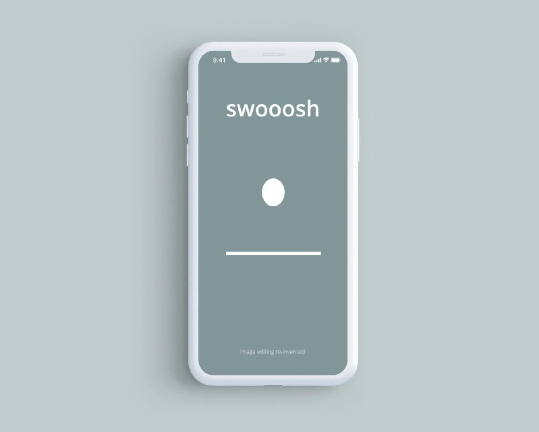
Swoosh Animation
A Simple series of animations completed for my first achievement in my Animation in UI course.
I had to create a:
pre-loader screen with a bouncing ball
followed by an activated menu icon which transformed into an arrow and back again, as well as changes colors
a sliding menu page with menu items
an activated photo which zooms and fills the page when clicked
and bottom menus that slide up when the photo is selected.
All animations were then put into a mock-up to simulate what they would look like on a phone. The colors choices and some other features were altered to make the animation uniquely mine.
I then used Media Encoder, the Bodymovin plugin, and LottieFiles to render the menu icon and preloader screens into gifs and prepare them for send off to a developer.
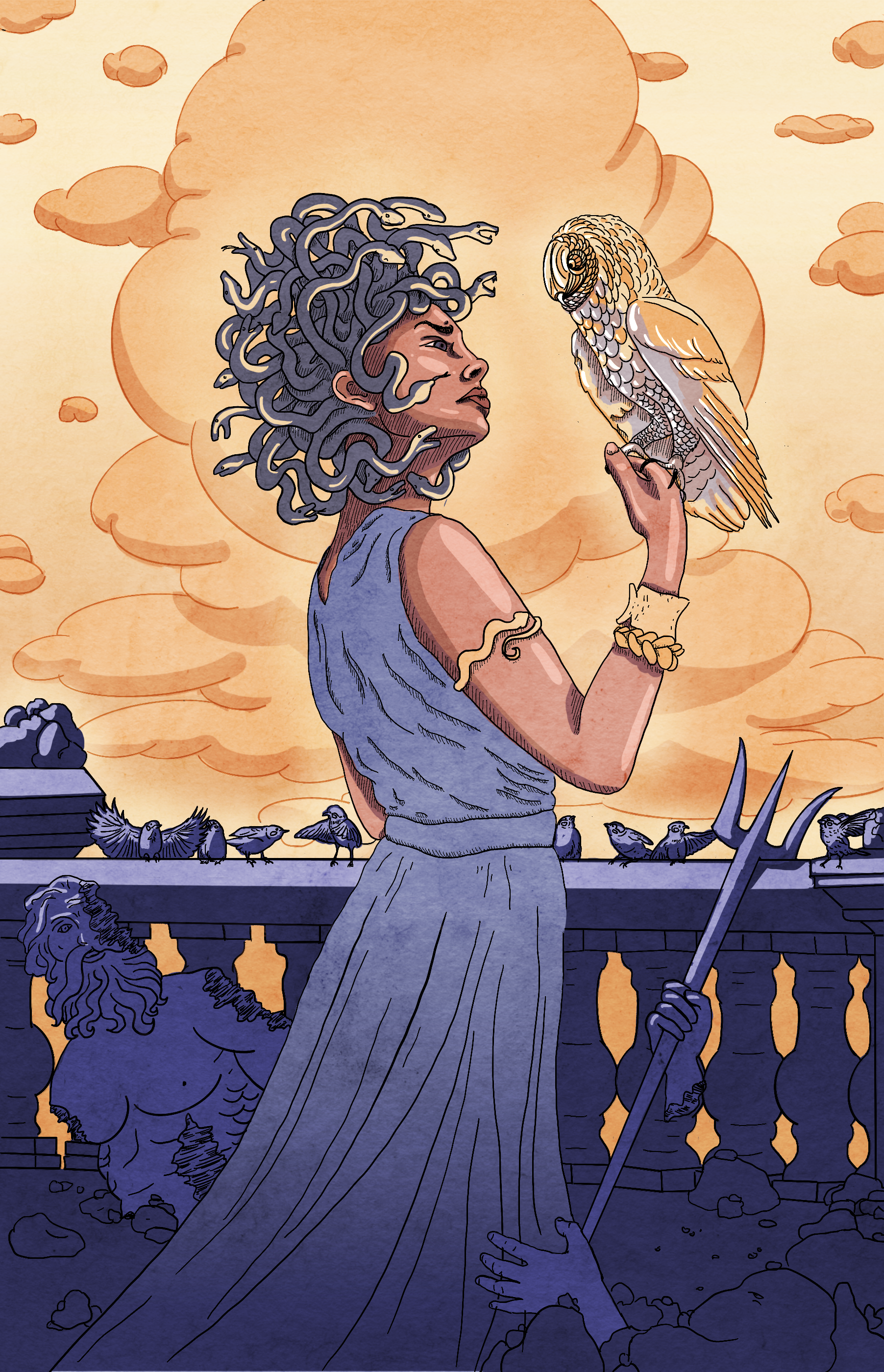
Medusa and the Owl
He came for her at twilight. He came with a purpose. Still dripping from the ocean, his bare feet slapped the tiles of the temple, leaving wet footprints shaped like flippers.
He came because he wanted her. He’d seen her on the shore, washing clothes in the ocean. And it didn’t matter that she was a servant of Athena. It didn’t matter that she was wed to her work. And it didn’t matter that she didn’t want him. Poseidon wanted her.
And Poseidon always got what he wanted.
He came for her and he took her—right there in the temple. Right there on the tile, her sisters scattering like geese. Barnacles and coral sprawled around his biceps and calves and cut her, cut her clothes and her skin, leaving her with long deep gouges and staining her white robes red.
But she didn’t feel them.
She didn’t feel it when Athena returned, angry, not at him, but at her for letting him.
Letting him. Athena’s words, not hers.
She didn’t feel it when Athena screamed, cursing her beauty. She didn’t feel her hair, the long curling locks writhing until they rose around her face, shifting from dark strands to dark snakes that hissed and twisted against her neck and scalp. Never settling. Constantly moving.
Her friend, whom she’d known since she was six, found her bleeding on the floor of the temple and pulled her to her feet. Her friend flinched at the snakes but turned her over, pulling her to her feet, turning her face to hers with a gentle hand.
She didn’t feel it when, in the midst of her friend asking what and how, in the midst of speaking her name, her sweet friend, her best friend, had frozen, eyes locked on hers.
She didn’t feel it when her friend’s face turned gray, her features hardening to stone, beginning with her head and traveling downwards, her body eclipsed, until she was nothing but a silent statue.
Her friend, now just another stoney tribute in Athena’s temple, was the last person to say her name. Her old name. Her dead name.
She supposed it was only fitting. She wasn’t that girl anymore. And she wasn’t a woman either. She was something else.
Medusa, they called her.
Medusssssaaa, they hissed.
Monster, Madwoman, Mayhem, they called her.
She felt their hatred, but she didn’t care. Their hatred didn’t matter. She felt her power and lack of. Her power to turn all her enemies to stone, and her powerlessness to have anyone close to her ever again. She couldn’t keep them safe. Not from herself. Powerful, and completely without power. This was her miracle. This was her curse.
But the worst of it was the birds.
Big, beautiful, birds of prey. The hunters.
They were drawn to the snakes. They couldn’t help themselves.
A quick meal, they thought. An easy meal. They came at her, their giant wings outstretched, their talons reaching. Merlins and vultures. Golden hawks and snowy owls. They came, and when their eyes met hers, they stayed, dropping out of the sky like falling boulders from a cliff. They decorated her home like gargoyles, and roosted silently, their flight forever suspended.
Even though they came for her, her deepest wish was to reverse the curse so that they could fly again. So that they could hunt again.
But until then, she would do the hunting. And the waiting.
Hunting and waiting for the day that he would emerge from the ocean once more, his feet slapping wetly against the smooth stone of her home.
On that day, she would come for him. She would hunt him. And he would be her last statue, her last prey. The last to say her name. And the last to fall silent.
Confessions of a Europa War Veteran
The Quiet
The Earth Forces didn’t understand, at first, why it was that The Quiet could never be beat.
They didn’t seem like a particularly advanced race. Their language was minimal. Their architecture merely functional. They had no written language, so far as we could tell. No art. Their scientific and engineering achievements were those of a younger, less advanced people. Perhaps five or six centuries behind humans.
They seemed simple. Basic. Uncomplicated.
But they were not simple—or stupid. And they were not young.
As the EF discovered later, theirs was an old race. They called themselves the Vedihara, but the ground troops took to calling them The Quiet—for obvious reasons. They hardly spoke—not even a click, whistle, or hum. Even when they moved—nothing. Nothing but the slightest whisper as their hind quarters scuffed the surface of the icy moon. But even this noise—ever so slight—was obscured by the constant wind on Europa.
Although they were odd and strange, things seemed to be going fine for a while. The two races co-existing as the EF explored the planet and interacted with this new people.
Everything was fine, that is, until Juno. Juno was a scientific outpost—a base 10,000 strong focused on learning more about the moon and its ecosystem. HQ checked in with them at 2200, and by 0800 every man, woman, and child on that base was dead.
The Quiet had poisoned the water supply.
Other bases were soon attacked. The reason? Unknown. The silence? Deafening.
EF retaliated, of course, but The Quiet were always one step ahead. No matter how many flanking maneuvers or surprise attacks—the humans couldn’t seem to make a dent in their forces.
At first, the EF thought they must’ve been mistaken about the Vedihara’s transport. Maybe it was better and faster than they’d anticipated? But no, even their ability to travel in the water beneath the ice didn’t account for the fact that no matter what EF did, they could never catch more than a squad or two. Yet, the Quiet seemed to be able to anticipate our every move.
It was then that a scientist by the name of LaCaille theorized that The Quiet weren’t as quiet as they appeared. They were communicating. We just couldn’t hear them because they were doing it telepathically, and across large distances. They were able to warn their brethren of approaching EF forces. And, not only that, but LaCaille also believed they were able to glean small glimpses of the future, which was why the EF was often only successful when a plan changed at the last moment and The Quiet were too slow to react.
And while this knowledge helped the EF to win more battles—commanders going into the field and not knowing the plan until the last instant, when a randomly chosen plan was sent to them from 390 million miles away—not even this could change the tide of the war.
That was where I came in.
There was another theory by LaCaille—brilliant woman that she was. The theory was that The Quiet didn’t come by their telepathy and knowledge of the future biologically. She thought it had something to do with the ecosystem. Something they injested. Something the scientific base on Juno had unwittingly uncovered before being wiped out.
A small plant—almost flower-like and shaped a bit like a beehive—that grows in the Southern Plains of Europa was the likely target. It was just a little blue flower, but LaCaille believed it was the key, and it only grew in an area the Vedihara had intimated was sacred to them.
At the beginning of my training with the corp I was approached by some higher ups. They told me that one day I might or might not be selected for a mission. If I was, it was imperative that I follow the instructions exactly—no matter how confusing or odd. No matter if I had to abandon my troop, leaving people to die, in order to accomplish my mission. Nothing, I was told, could be more important.
In the coming months the reality of this encounter seemed further and further away. And when I got the text stream in the middle of one of the worst aerial battles I’d ever seen—I almost couldn’t believe it. And when I told my crew that I had to abandon ship—I was the pilot—they almost couldn’t believe it either.
But I’d received a directive, and they knew what that meant. No questions. Time was of the essence. Because now that I had the info, the likelihood was that The Quiet now had it, too.
When my copilot was blasted and killed by a ground weapon—The Quiet must’ve commandeered one of the artillery outposts below—the crew did start to question my decision to leave. Well, actually, they begged me to stay. One of my crew even wounded me in a desperate act to keep me there. He might’ve killed me, but another crew member was able to tackle him to the ground, and instead he hit me in the shoulder.
But the text stream was very specific. The war hinged on this moment. Thousands of lives were at stake. I had one mission and I was to risk everything for it. Gather as many samples of this plant as you can. Place them in delivery drones, which all have randomized destination coordinates. Do this until you are either rescued or killed. Do not fight unless to protect yourself. Do not stop for any reason—even to help someone.
There is nothing more important.
Those words stay with me as I crawl along the icy surface, one fist grasping the sacred plant, the other my wounded shoulder. Around me is a graveyard of ships and my fellow soldiers. Above me the battle still rages. And when the spotlight comes down, alighting on my face, I wonder. Will I be rescued? Or is The Quiet coming to claim me at last?
Hook's Lament
He had died so many times, what was one more death? What did it matter?
James stood on the prow of his ship, his hooked hand winking in the sun. His sword was heavy at his side. He was tired, so very tired, but he still had a little self-respect, just a little—enough to stand while he waited for the horde of children to come trampling down the hill and toward the moored ship.
He took a sip from his flask. His hand shaking. It was no longer death that he feared. It was pain.
The man-child had killed him so many times. James had lost count. His favorite was swordplay—stabbing that is. James had been stabbed in the heart, the side, the leg, the kidney, the stomach. Once the boy had put a sword through his boot, pinning him to his own deck. It was humiliating.
But, it wasn’t just the blade. The boy enjoyed killing him in other ways as well.
He had set James’ ship aflame, burning him and his crew to a crisp. He’d drowned him, crushed him in a rocky avalanche, and pushed him off a cliff.
The cocky man-child with his wicked little grin, his army of screaming brats, had come for him time and time again. He never seemed to tire of it. And if he did, well, he’d just start a war with the natives and James would have peace for a month or two.
But the Pan always came back. He had a particular fondness for James. A strong desire to destroy not just his body, but his mind.
He didn’t just beat him physically, he also called him names—“You’re old. You’re ugly. You’re weak.”
He constantly taunted him. “You can’t fly. Can’t crow. Your crew hates you.”
James was strict, but he knew his crew loved him. At least, as best they knew how. James was disciplined, and he disciplined his crew, but he was always fair and never mean. It was the Pan who was cruel. Stealing those children from their families. Filling their heads with lies.
“Your parents hate you. They don’t love you. Don’t want you. Stay here with me and I will show you how to live—how to always have fun and never grow up.”
Those poor children. And when he was done with them, when they weren’t fun anymore, he discarded them. Or he drove them away and blamed them for leaving, even though it was always his fault.
Yes, the Pan hated responsibility. Hated taking responsibility. Nothing was ever his fault. The only one who’d ever been able to reach him was the Wendy girl. Lovely Wendy. But even she couldn’t change him. And eventually she had to leave—to grow up and live her life.
James envied her that. He could never leave. He must stay here on this dratted island—this island that bent its will to that flying scheming imp. He must stay, one-handed, locked in constant battle with a sociopathic demon child who had the gall to call him, Captain James Hook, the villain.
“You’re an evil old man! A villain and a rake!” Pan screamed once, perhaps a century ago. And then, with a mighty swing, he’d cut off James’ hand. As James cradled the stump, unworried about bleeding to death—because at least then he’d get some rest—he watched the pipsqueak toss his hand to the crocodile below, giggling and snorting as he did so.
The croc still followed James wherever he went—waiting, as it were, for the other hand to drop.
“Yes,” James said, rubbing the hook that he was now named for. “I am surely the villain.”
His voice was drowned out as the horde grew louder, drew closer. He could feel Smee, his first mate, trembling beside him. Pan’s angry pixie buzzed around James’ head, whispering obscenities in her tinny voice. He swung his hook at her, wishing he could pin her like a moth to an entomologist’s board.
The wind rose and with it rose Pan, floating in front of the sun as if he were going to eclipse it. His shadow spread across the ship, his sword raised high, its blade seeming to cut across James.
"Proud and insolent youth," said James,"prepare to meet thy doom." He didn’t believe a word of the script, but he hoped it was true.
“Dark and sinister man," Peter answered, "have at thee.”
Again, James thought. Have at thee again, and again, and again . . . He sighed, raised his sword, and swung.
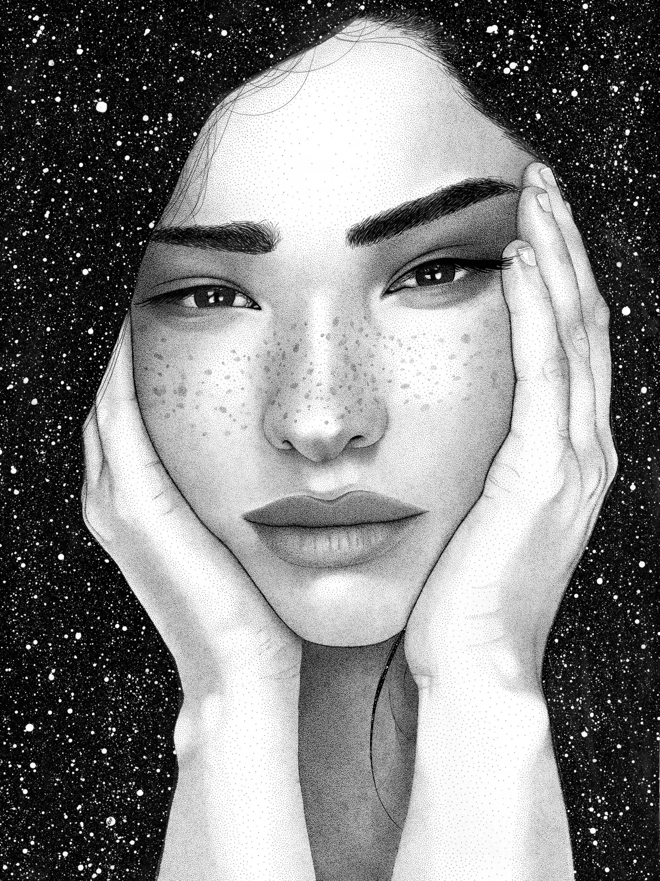
Lucia
Lucia - from the latin word, “lux,” meaning light.
Pen & Ink. The face and hands are stippled, while the background is loose ink and white acrylic paint spatter (for the stars). 18x24. Spring 2019.
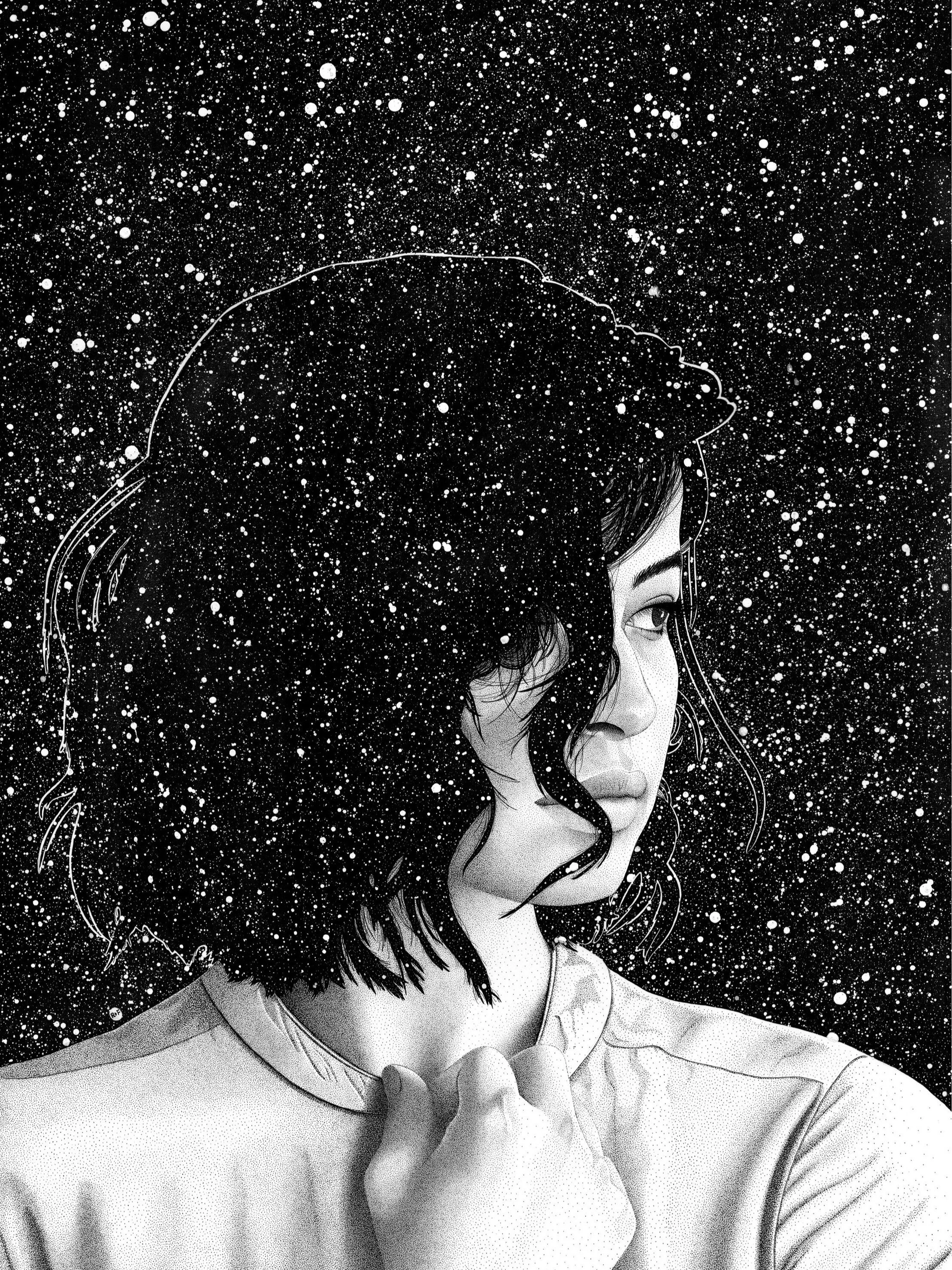
Thea
Thea was the Greek titaness of sight. She endowed gemstones and gold with their brilliance. She was also called Euryphaessa, the “far-shining one.”
Spring 2019
Created with small-nibbed technical pens (1mm & 3mm), lots of black ink, and a splash of acrylic white paint (for the stars of course). The technique used to compose the piece is called stippling and involves the artist using dots to create shade and shape.
Hyperion
This piece features Hyperion, the Greek titan of heavenly light, and the father of the dawn, the sun, and the moon.
It was created with small-nibbed technical pens (1mm & 3mm), lots of black ink, and a splash of acrylic white paint (for the stars of course). The technique used to compose the piece is called stippling and involves the artist using dots to create shade and shape.
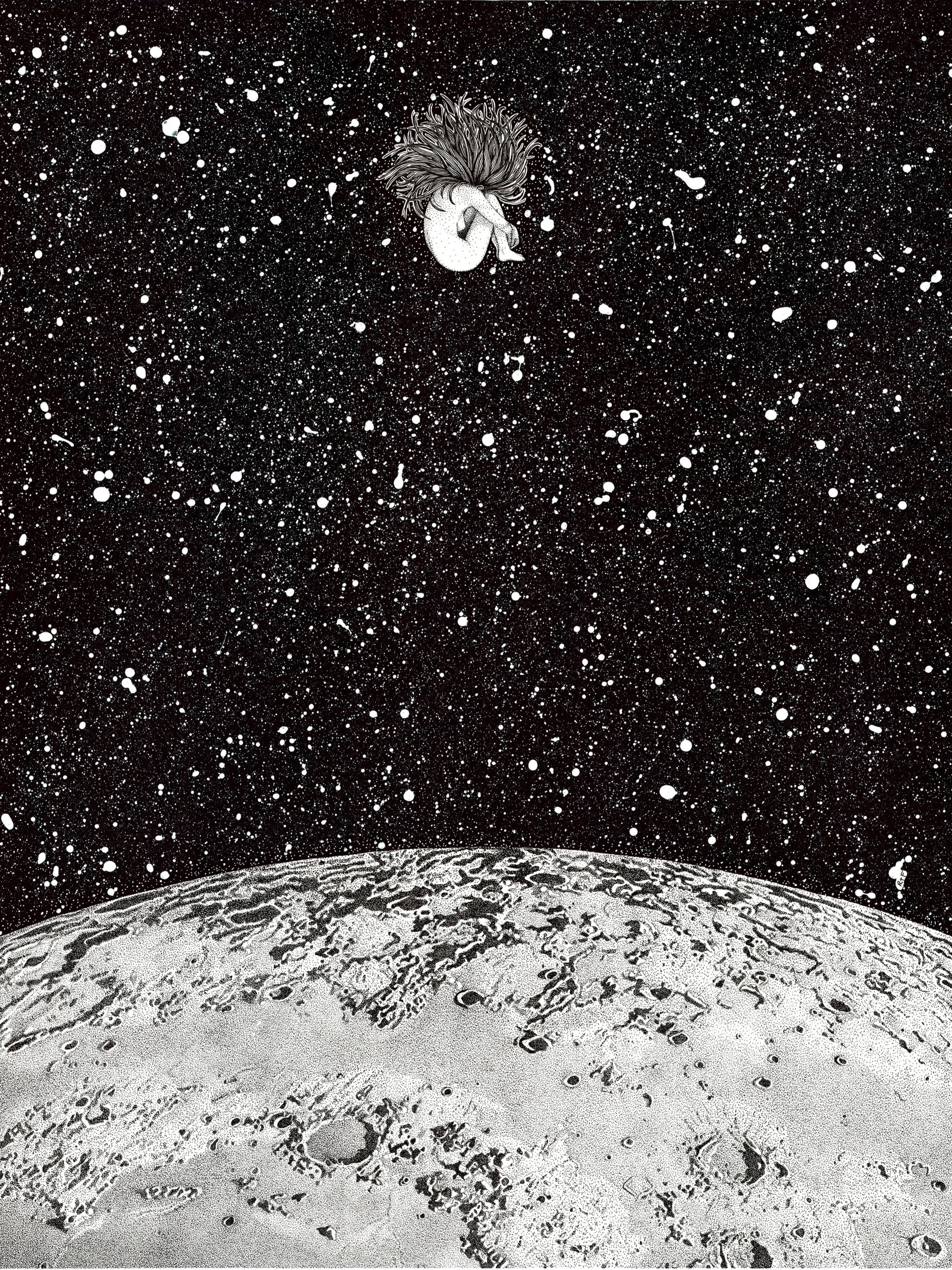
No Atmosphere
This piece features the moon set in a starry night sky. She sits bare, exposed, and with no atmosphere. Above her, a woman floats, a perfect mirror. She is exposed, yes, but she's also free. Lonely, but content.
This galaxy illustration was created with small-nibbed technical pens (1mm & 3mm), lots of black ink, and a splash of acrylic white paint (for the stars of course). The technique used to compose most of this piece is called stippling and involves the artist using thousands of tiny dots to create shade and shape.
Closeness of the Moon
This illustration was inspired by Italo Calvino's brilliant short story, "The Distance of the Moon," from his collection of short stories, Cosmicomics. I call the illustration “The Closeness of the Moon,” as a play on that title—because as it drifts away from the Earth, it always comes back.
It is the perfect gift for literary lovers, astronomy enthusiasts, and dreamers in your life.
The original ink illustration was completed using a stippling technique, in which the artist used small dots to create the illusion of form and depth.
The Moon Balloon
This picture features a young girl, Eleanor, as she makes her way across the Pacific in the Moon Balloon fashioned for her by Artemis. On her journey she sees many wondrous things above and below, and uses her dead man's compass to guide her--which points in all six directions--as well as her most precious item, a telescope made from star glass. In this scene she spies Geronimo, the Last Pirate, and considers the costs of helping him unmoor his ship from the jagged rocks below.
The original ink illustration was completed using a stippling technique, in which the artist used small dots to create the illusion of form and depth.
Sunna
It features Sunna or Sol, the German/Nordic goddess of the Sun. Although, I've also taken to calling her Sun Bun, since her hair doubles as a fiery star.
This is the first in my Milky Way series. The series will include all of the major celestial bodies in our galaxy.
This piece was crafted by me with a 0.1 mm technical pen on Bristol paper. The print you will receive is meticulously crafted and a perfectly rendered reproduction made with archival inks on heavy-weight paper.
Venus
This piece features Venus or Aphrodite, the Roman/Greek goddess and her planetary namesake, Venus. In myth this goddess was known for her passion, her sexuality, her beauty, and her ability to inspire/bestow victory and prosperity.
Venus, the planet, was commonly mistaken by sailors and others as the morning or evening star.
This piece was crafted by me with a 0.1 mm technical pen on Bristol paper. The print you will receive is meticulously crafted and a perfectly rendered reproduction made with archival inks on heavy-weight paper.
Gaia (Earth)
This piece features Gaia (or Gaea), the Greek goddess of the Earth and her planetary namesake. Gaia's also known as Mother Earth. She was mother and wife to Uranus, the god of the sky, and the mother of the Titans. Her Roman equivalent is Terra.
Gaia is part four of my Milky Way series, in which I personify the celestial bodies in our solar system.
This piece was crafted by me with a 0.1 mm technical pen on Bristol paper. The print you will receive is meticulously crafted and a perfectly rendered reproduction made with archival inks on heavy-weight paper.
Mars (Ares)
This piece features Mars (or Ares), the Roman god and his planetary namesake. He was the god of war and agriculture. The month of March (Martilius) is named for him. Although his Greek equivalent is the well-known and well-hated Ares, Mars was seen as a less destructive force to the Romans, and one which focused more on military gains rather than chaos for the sake of chaos.
Mars is part five of my Milky Way series, in which I personify the celestial bodies in our solar system.
This piece was crafted by me with a 0.1 mm technical pen on Bristol paper. The print you will receive is meticulously crafted and a perfectly rendered reproduction made with archival inks on heavy-weight paper.
Ceres (Asteroid Belt)
This piece features Ceres, the Roman goddess. Ceres is also the largest asteroid in the asteroid belt between Mars and Jupiter. In fact, it is a dwarf planet. In this piece, the asteroid Ceres is replaced by the mythological figure of Ceres, who is the goddess of agriculture, fertility, and motherhood. She is surrounded by some of the other asteroids in the belt.
This is the sixth in my Milky Way series. The series will include all of the major celestial bodies in our galaxy.
This piece was crafted by me with a 0.05 mm technical pen on Bristol paper. The print you will receive is meticulously crafted and a perfectly rendered reproduction made with archival inks on heavy-weight paper.


