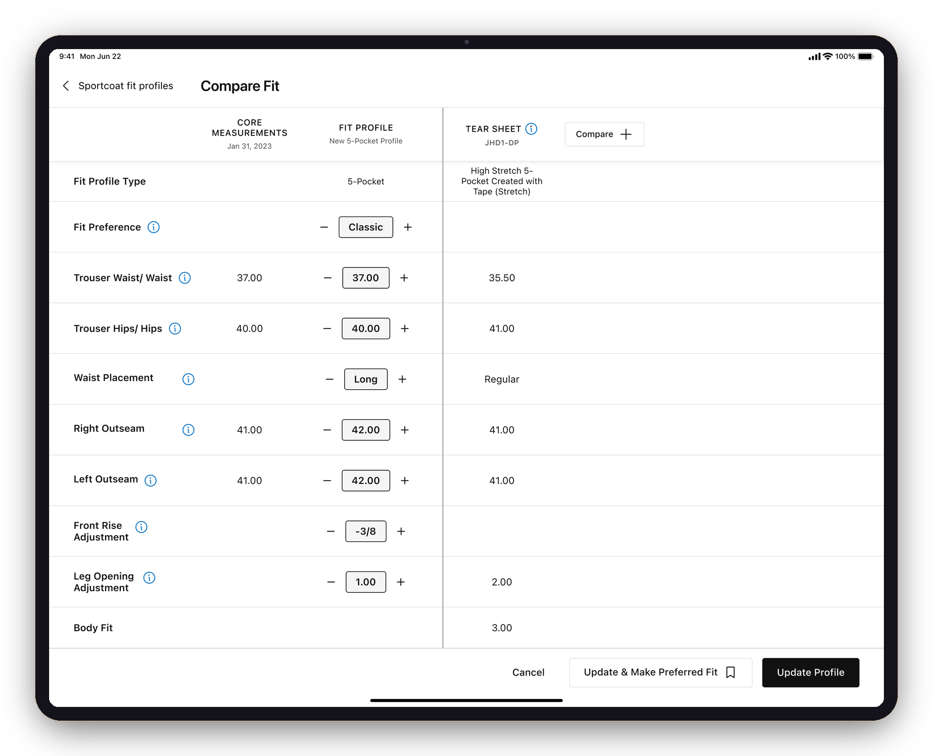
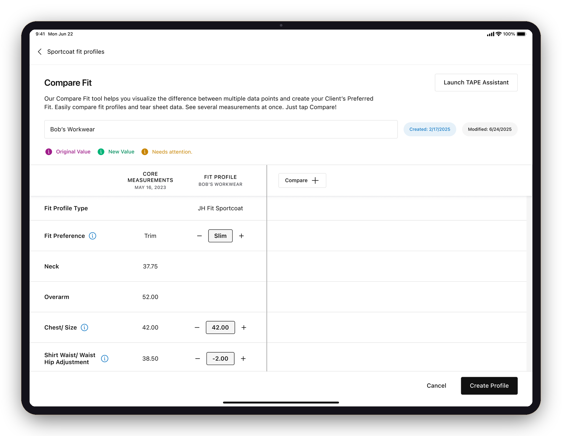
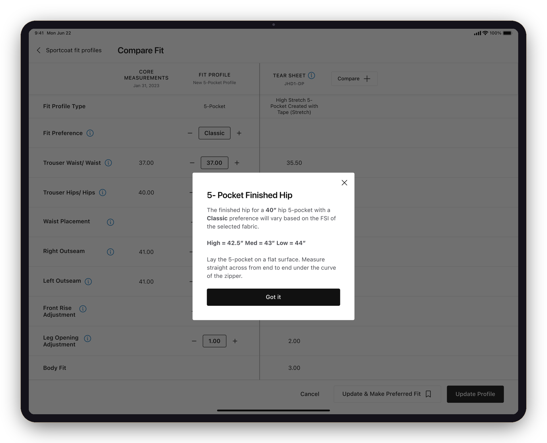
A split-screen tool that puts a client's fit profiles, measurements, and past orders side by side. The comparison finally lives on the screen — not in the stylist's head.
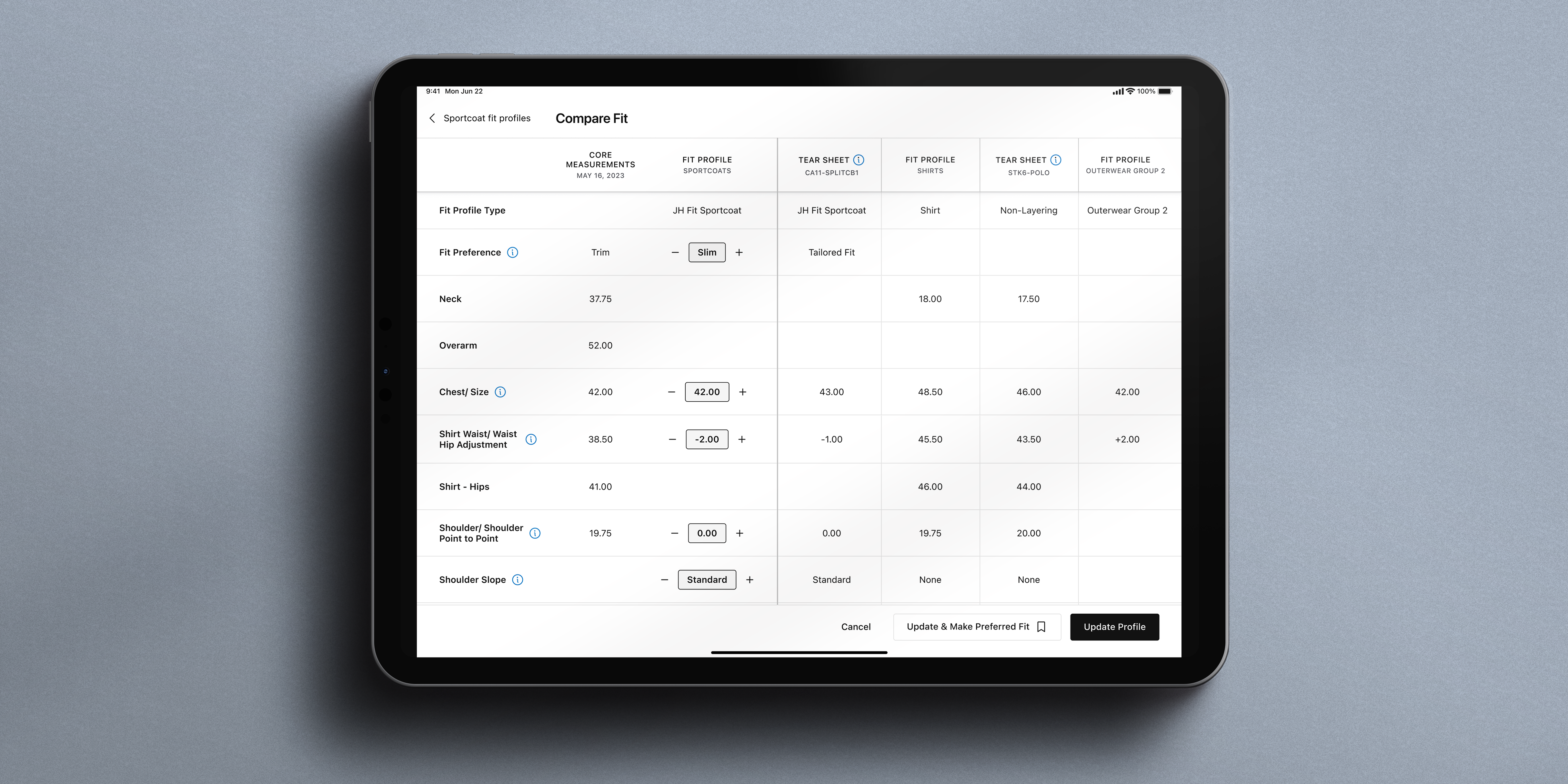
Research surfaced a behavior: stylists were opening the same client in several browser tabs just to compare a fit profile against a tear sheet, or measurements across categories. Compare Fit gives them one view that does what the tabs were doing — and a way to keep adding columns until the comparison answers the question.
A brand-new feature with no Green Room precedent — conceived, scoped, and designed end to end by me. I pulled the +/− stepper from the Core Measurements redesign so it reads as one continuous system, not a bolt-on.
Stylists were opening the same client in three or four browser tabs just to hold a comparison in their head. Compare Fit replaces all of them.
A vertical line splits the workspace. The left panel stays put — measurement labels, the client's Core Measurements, and the active Fit Profile. The right panel scrolls: each column is another fit profile or tear-sheet item, added with Compare + until the comparison answers the question.
The active Fit Profile is live — the same +/− stepper from the Core Measurements redesign. A color key (original · new · needs attention) tracks every change, and a gold ribbon marks the client's Preferred Fit, which always loads leftmost as the anchor.
Tapping the ⓘ next to a measurement opens a contextual explainer — what "5-Pocket Finished Hip" means, how it shifts with fabric stretch, how to take it — layered right over the comparison. No navigation, no lost place.
Compare Fit opens from wherever the decision happens: the Shopping Bag, Fit Profiles, the Client Profile, and the Tear Sheet — and when it's opened from a tear sheet, that item loads into the comparison automatically.
Opened from a Tear Sheet, the item loads into the comparison automatically.
The most useful research finding I've ever shipped wasn't a number. It was a behavior — "I have to open three tabs to do this." Once I heard it, every other request from stylists started sounding like a workaround for the same missing feature.
Compare Fit is the most direct line I've drawn from a research signal to a shipped design. The split-panel layout, the +/− stepper, the gold ribbon, the four entry points — every decision points back to a thing a stylist was already doing the hard way. The job was to stop interpreting and start translating.