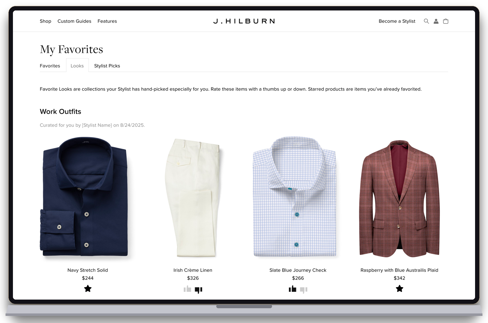
A stylist recommends, the client rates, and the back-and-forth gets out of the way. Simple and direct — the way he shops.
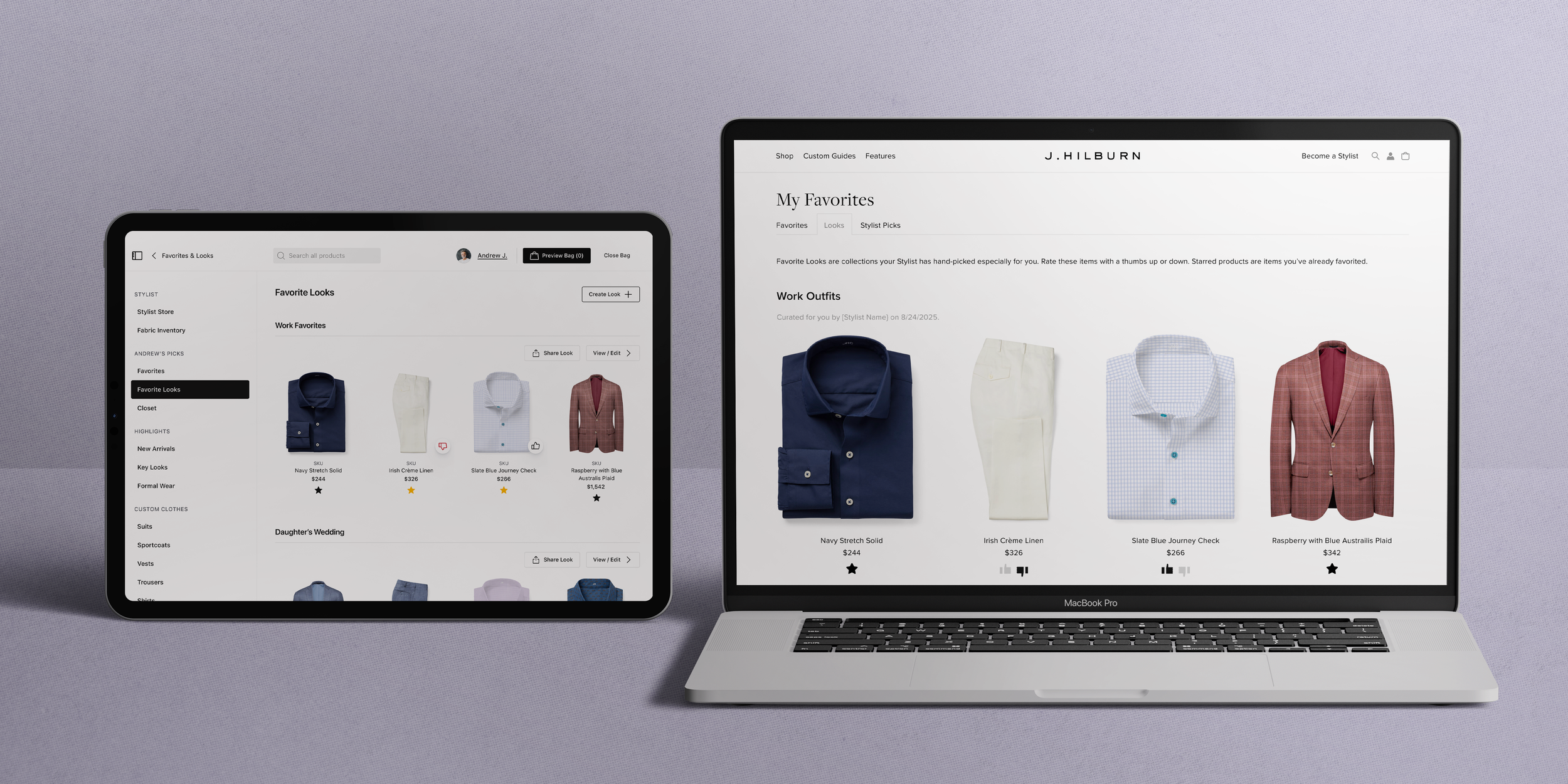
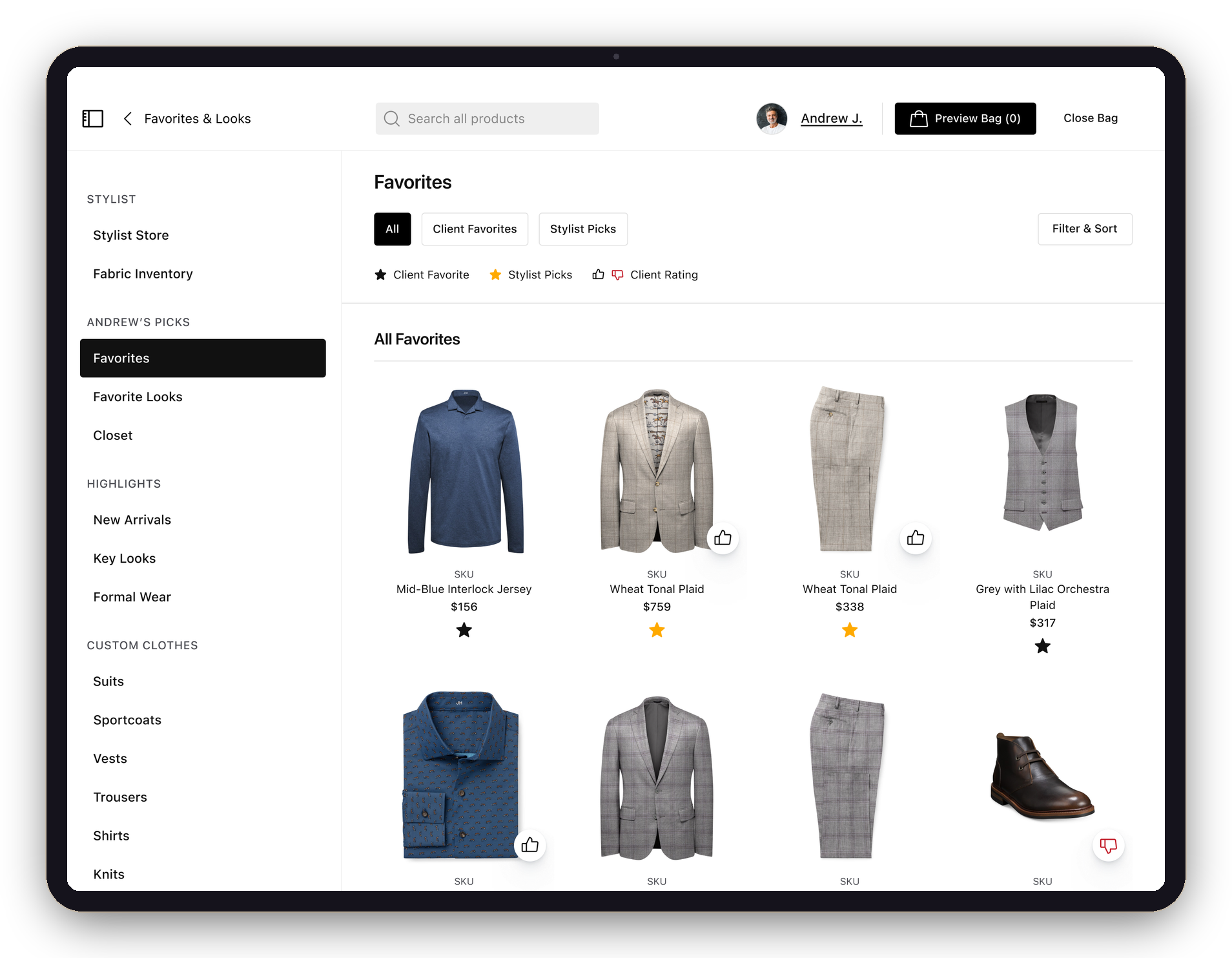
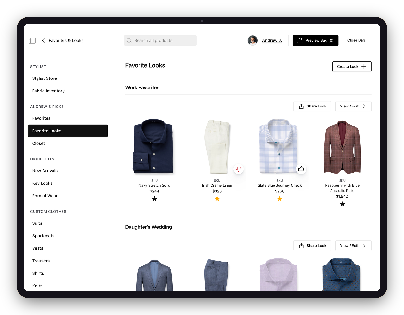
Every stylist we interviewed brought up Favorites — already their most-used sales tool, but flat and one-directional, with no way to tell a stylist's pick from the client's own.
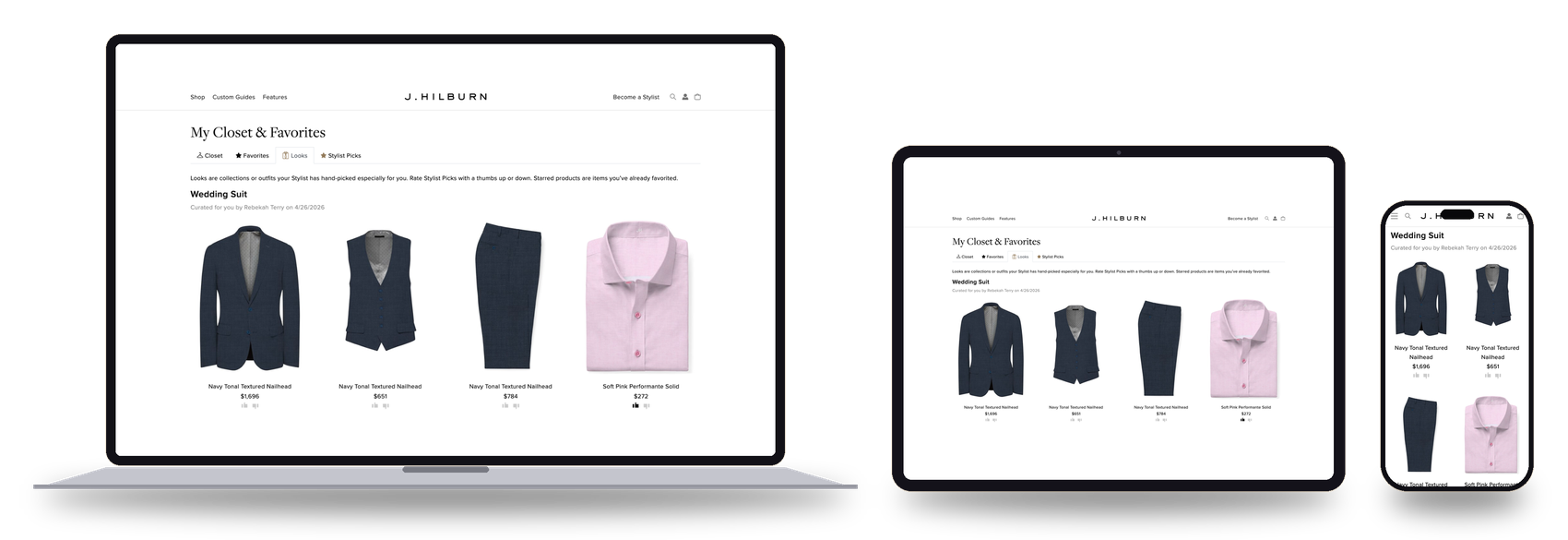
I helped run the interviews across two markets, formed my own hypothesis set alongside the PM and engineering lead, then designed both sides of the system — the full iPad experience and the client-facing jhilburn.com pages at every breakpoint. 1,991 frames, designed end to end, solo.

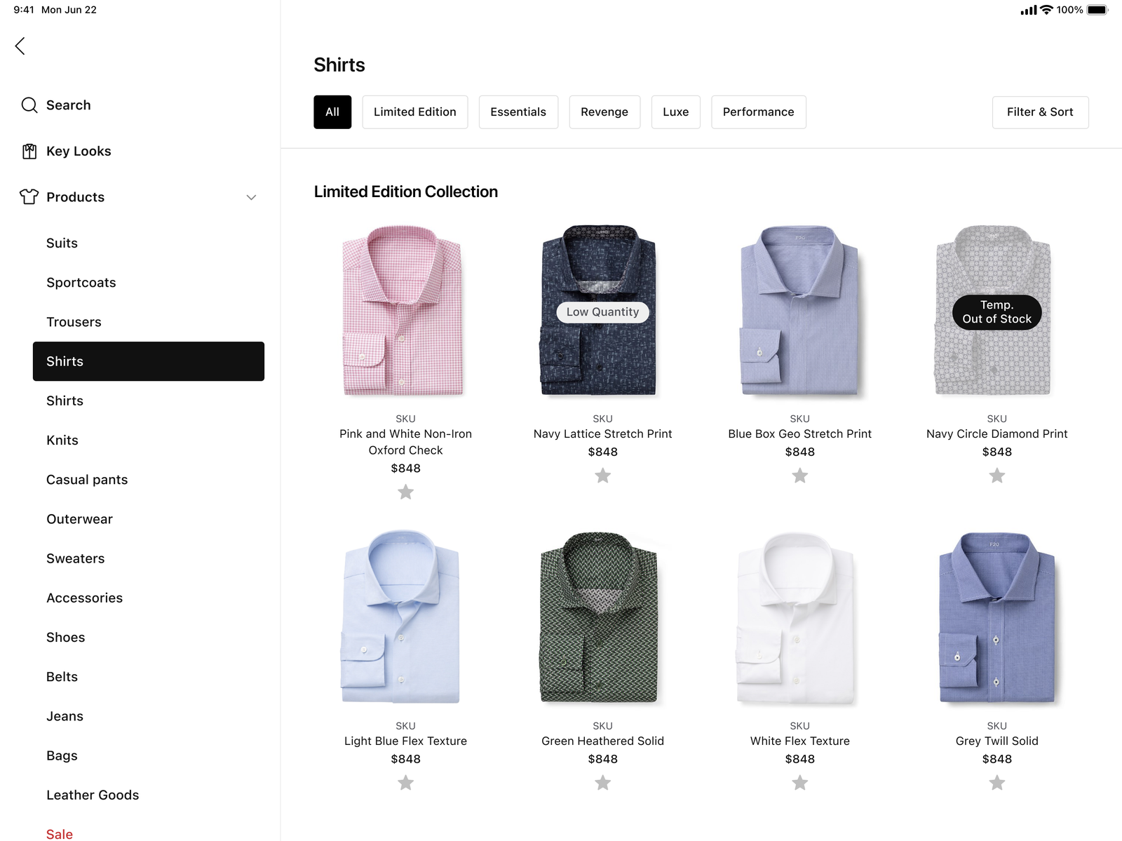
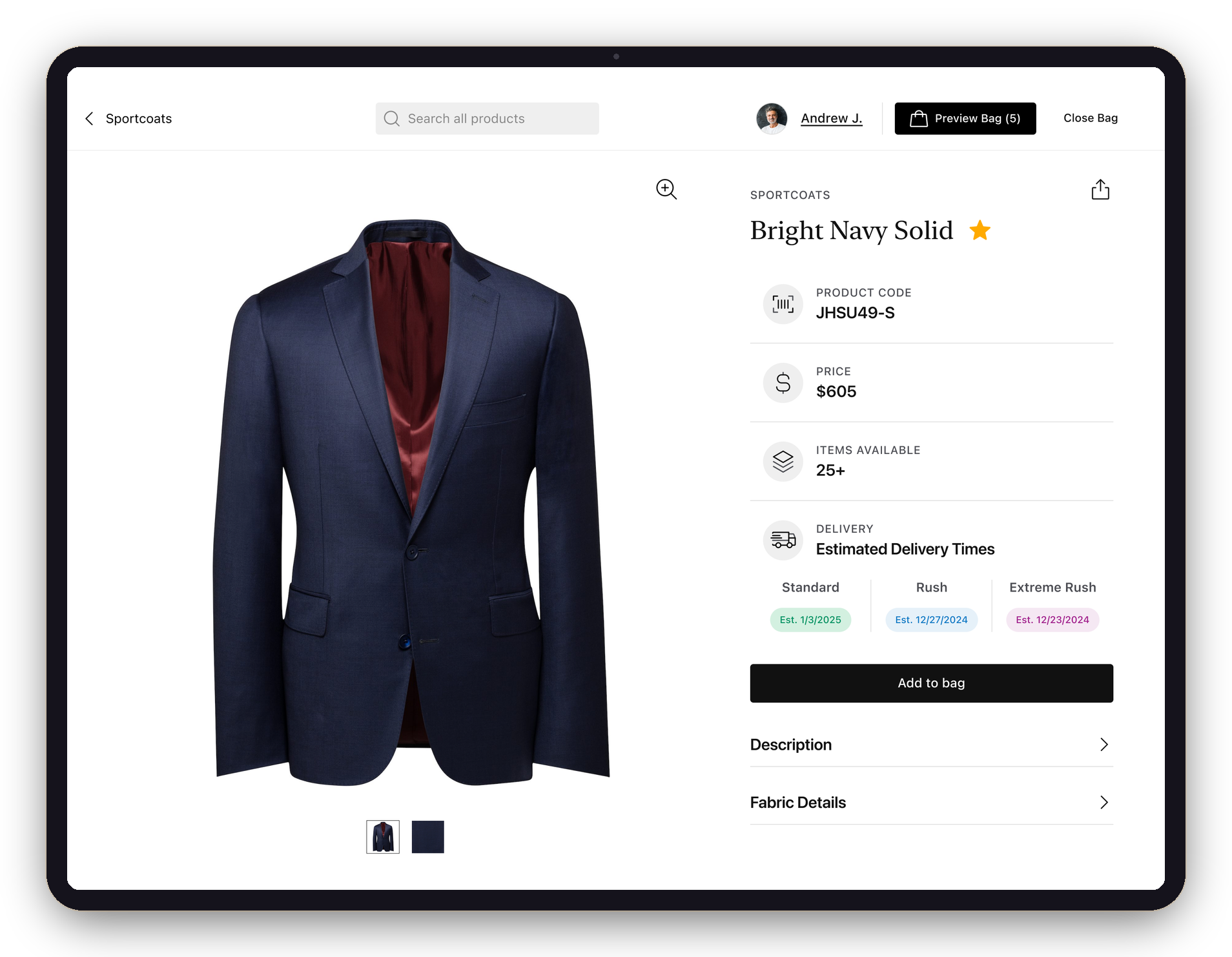
One icon, two states — the star lives on every product, catalog to PDP.
Improving Favorites is imperative to the Stylist's sales process and experience.
Style boards were the official curation tool — but stylists called them "sticky" and "hard to line up" in an appointment, and had quietly drifted to Favorites instead. A user-invented workaround is a spec in disguise: rather than patch style boards, I made the thing they were already doing intentional.
Synthesized from structured interviews with 13+ stylists across the Boston and Florida markets — the PM, engineering lead, and I each producing an independent hypothesis set before cross-referencing.
A closed loop across two platforms. Each beat happens inside a tool the person already uses — the stylist never leaves the iPad, the client never leaves jhilburn.com, and neither has to message the other.
One tap turns the star gold — on a product card, a PDP, or from the client profile. That item is now a Stylist Pick for that client.
The pick lands in the client's Stylist Picks on the web — "items your Stylist hand-picked for you" — with a thumbs up or down. The same client view reflows from desktop to iPad to phone, so a client rates wherever they are. No app, no message.
The rating — and the client's own black-starred favorites — surface back in the stylist's app, ready before the next appointment, with zero coordination.
The client side shipped on jhilburn.com as responsive web — My Favorites, Stylist Picks, and Looks, each designed at multiple breakpoints.
Stylists sell in outfits, not single products. Favorite Looks groups starred items into named looks — "Work Favorites," "Daughter's Wedding" — shareable, editable, and rated piece by piece. The loop runs through them too: a stylist sees not just that the client liked the wedding look, but which piece they didn't. And like everything else, looks live on both sides.
iPad — looks named per client, shareable, with item-level ratings.
jhilburn.com — the same looks, client-facing.
Interactive Favorites didn't just ship — it became part of how stylists are brought up to speed. This is the walkthrough J.Hilburn made for stylists on using the feature day to day.
J.Hilburn stylist training — Interactive Favorites · 2:20
The hardest part of this system wasn't designing 1,991 frames — it was resisting the urge to add things. Every version of a collaborative feature wants chat, comments, notifications. The discipline was making the loop carry itself — if the star and the thumbs do their jobs, no one needs to say anything.
It also changed how I read research. Stylists never asked for "Interactive Favorites" — they complained about style boards and kept using a flat list instead. The feature was sitting in the gap between what people said and what they did. Designing both sides of it, on two platforms, from one research effort, is the project I'd point to first if someone asked what I do.