Fit Survey.
A full redesign of J.Hilburn's pre-appointment client survey — the flow a stylist uses to onboard a new client. And I didn't just design it. I built it in native iOS.
The brief · my role
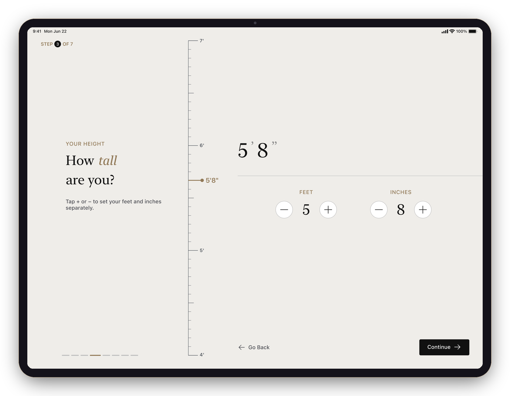
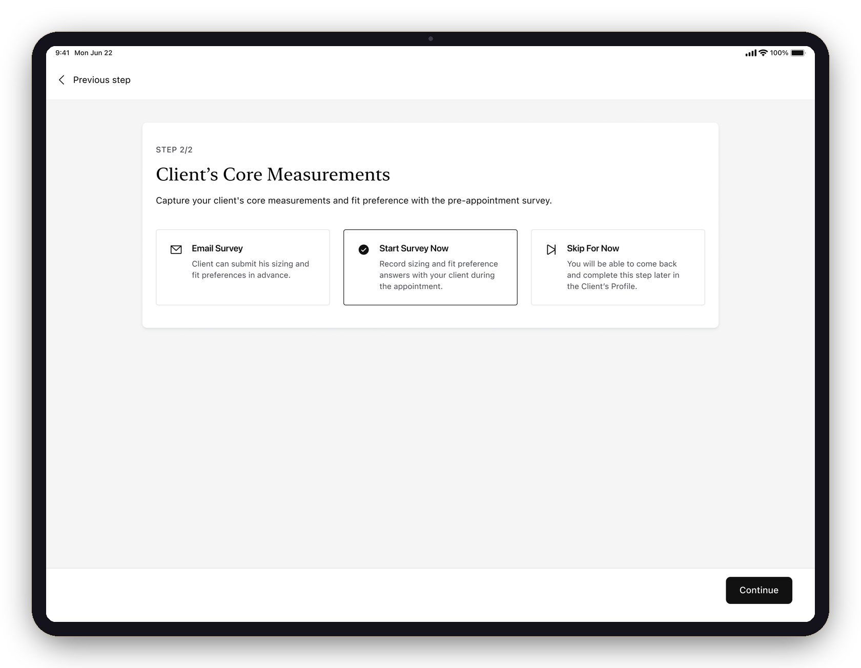
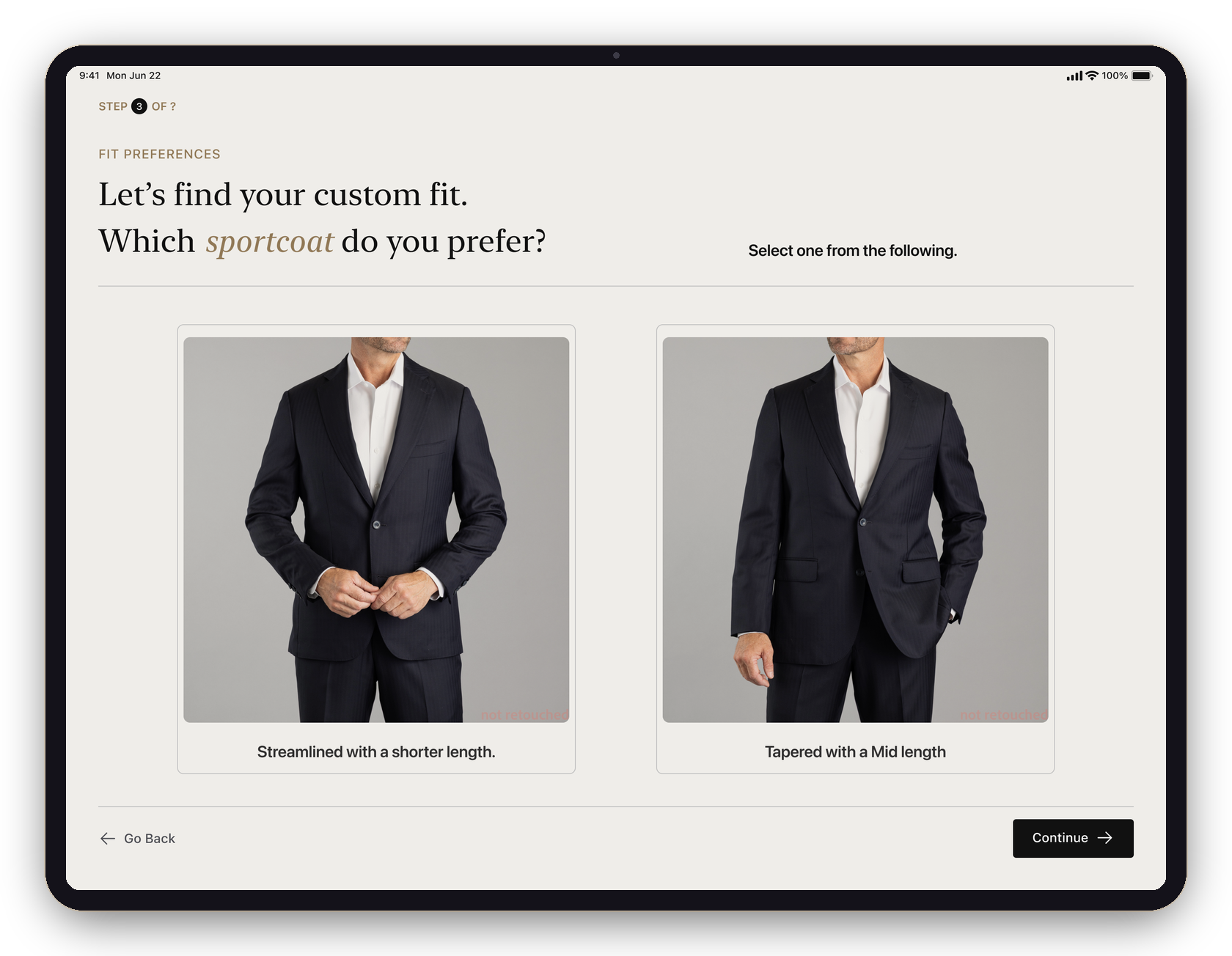
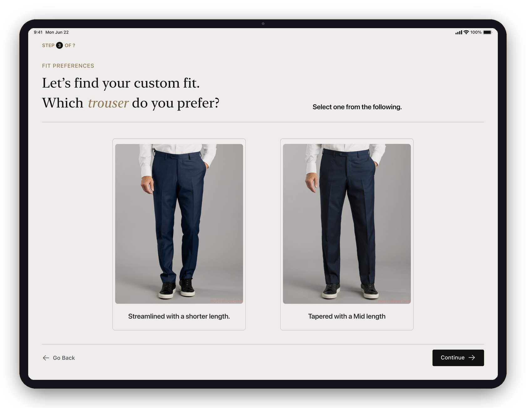
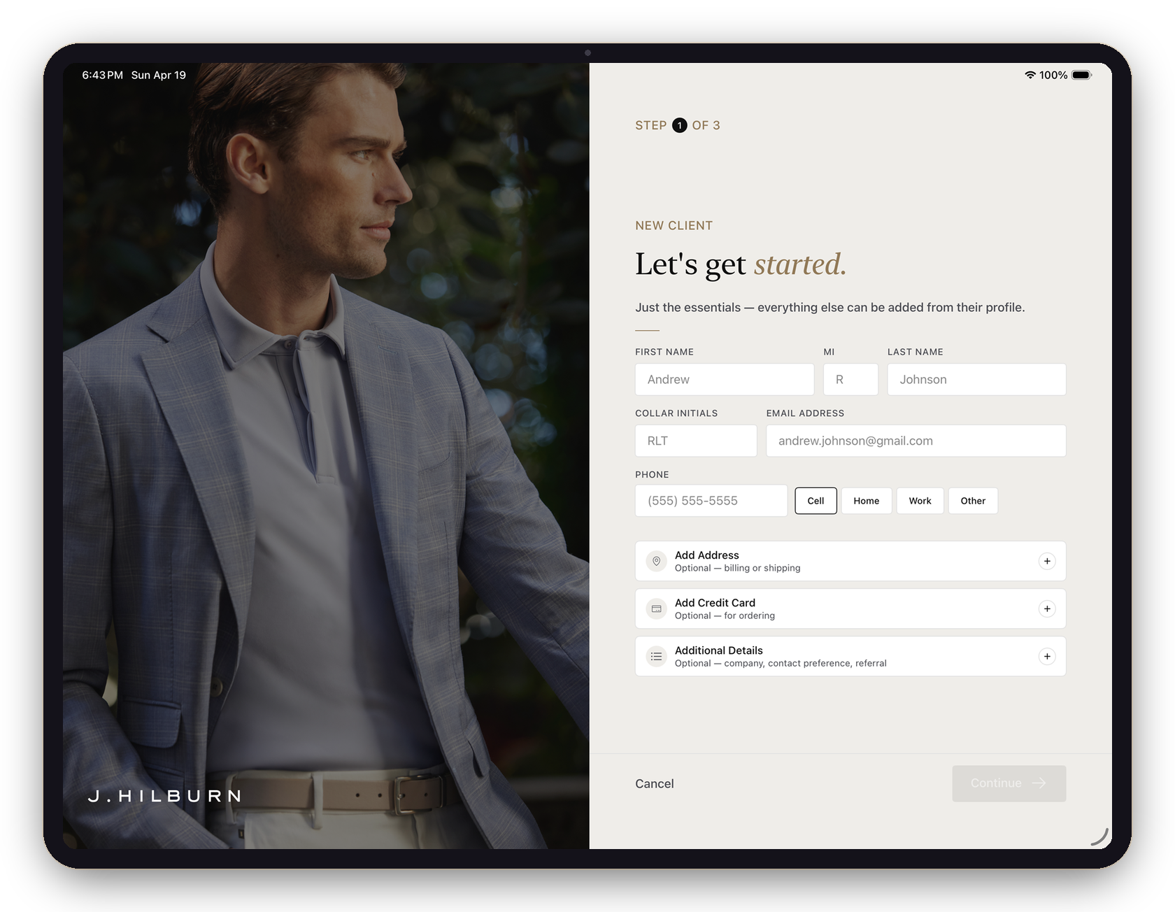
Make the intake worth finishing.
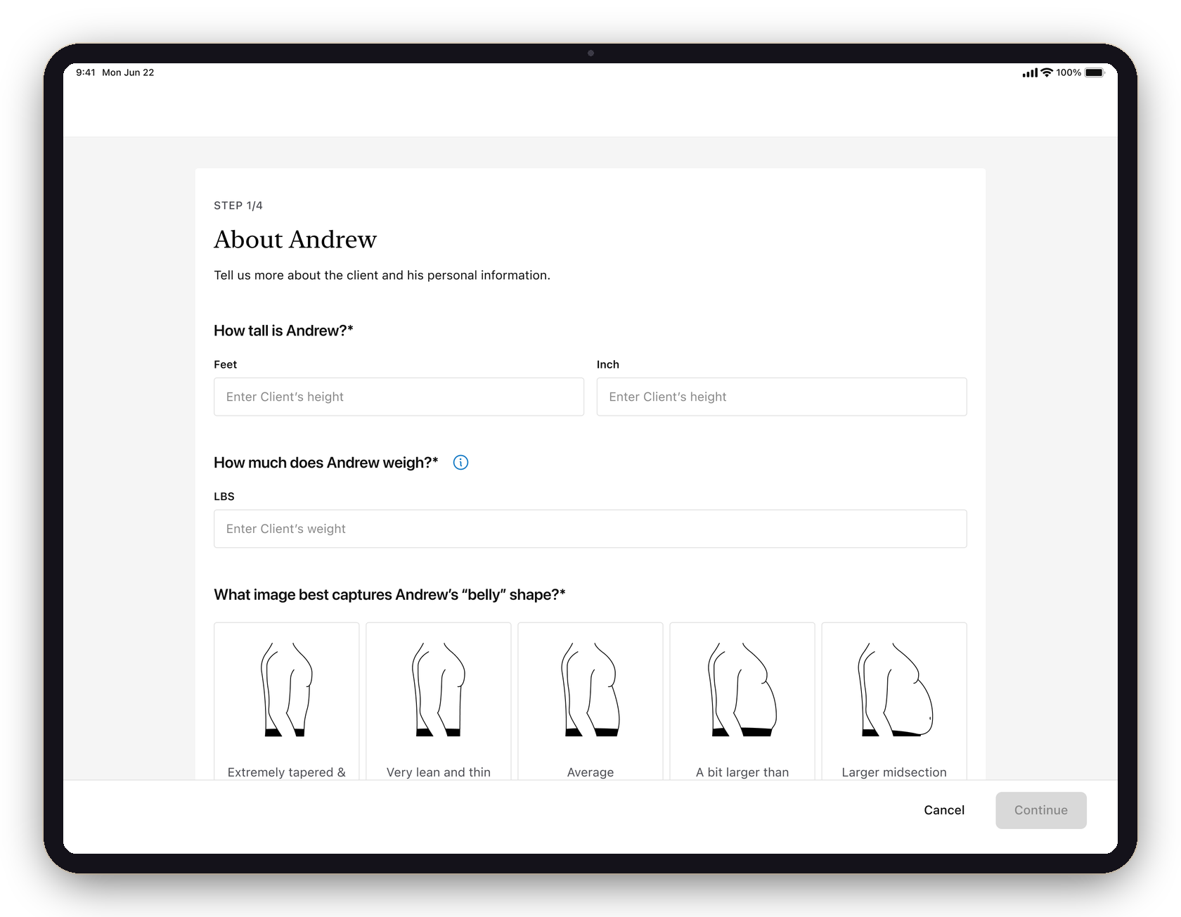
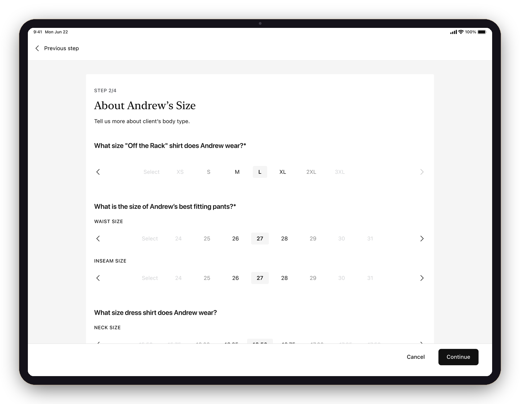
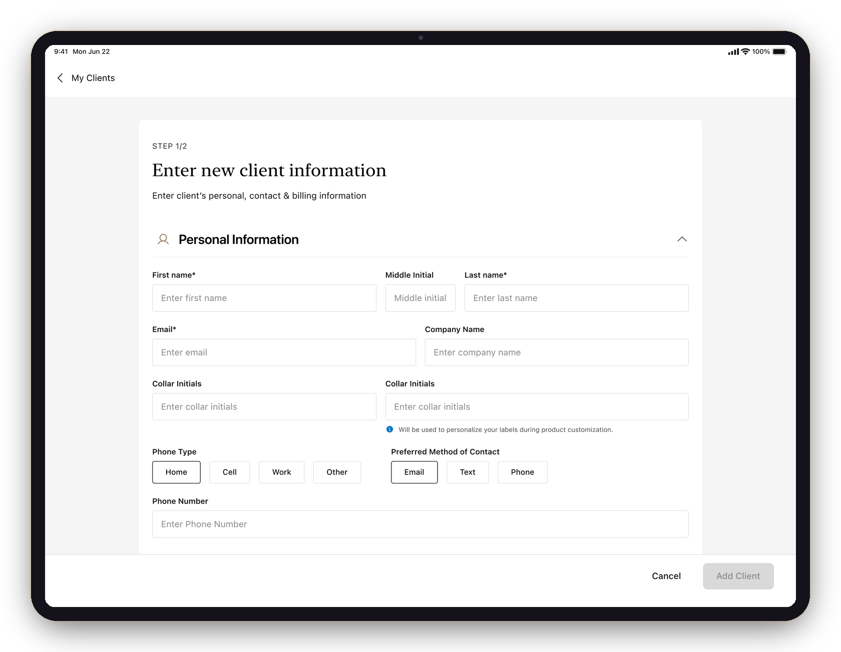
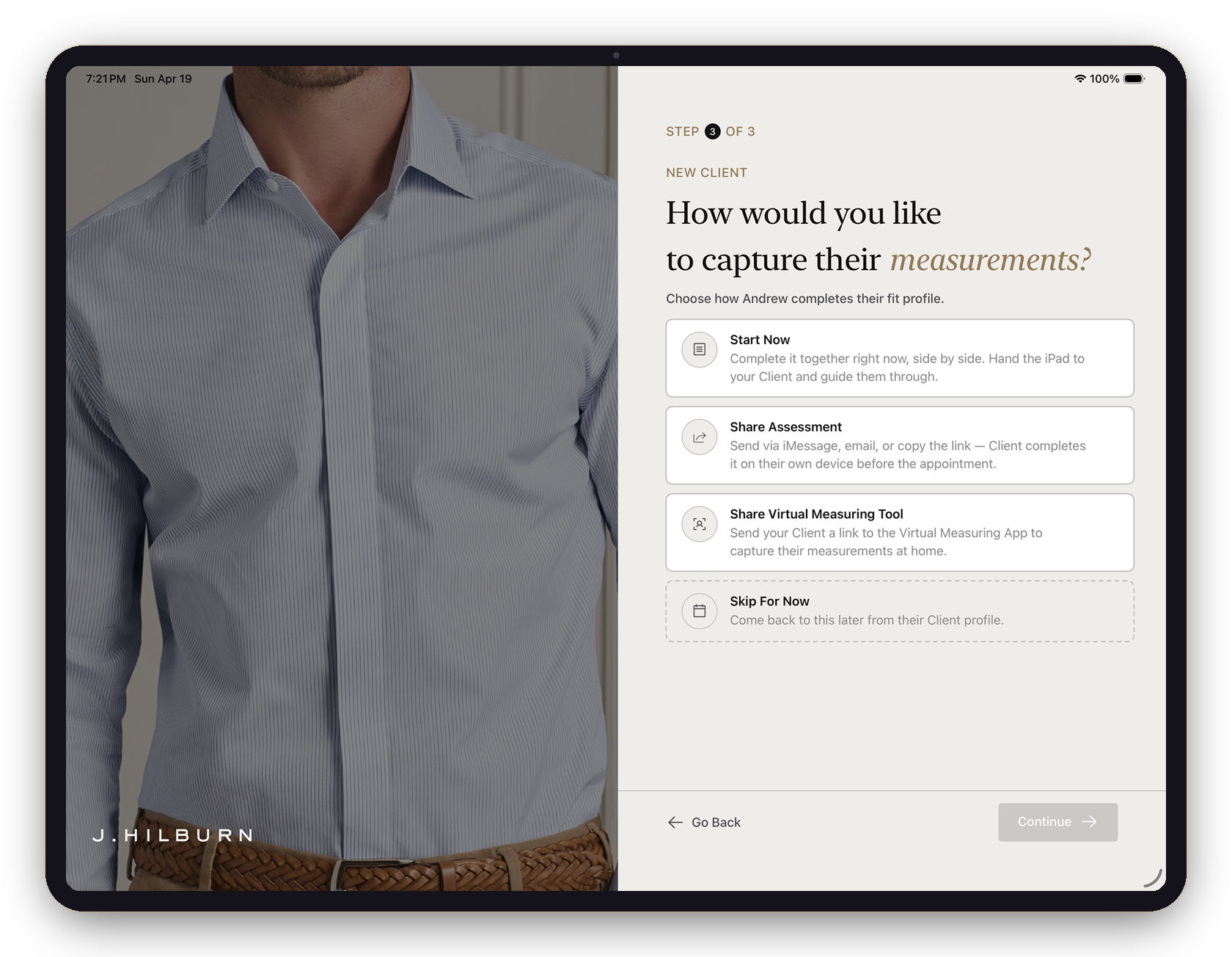
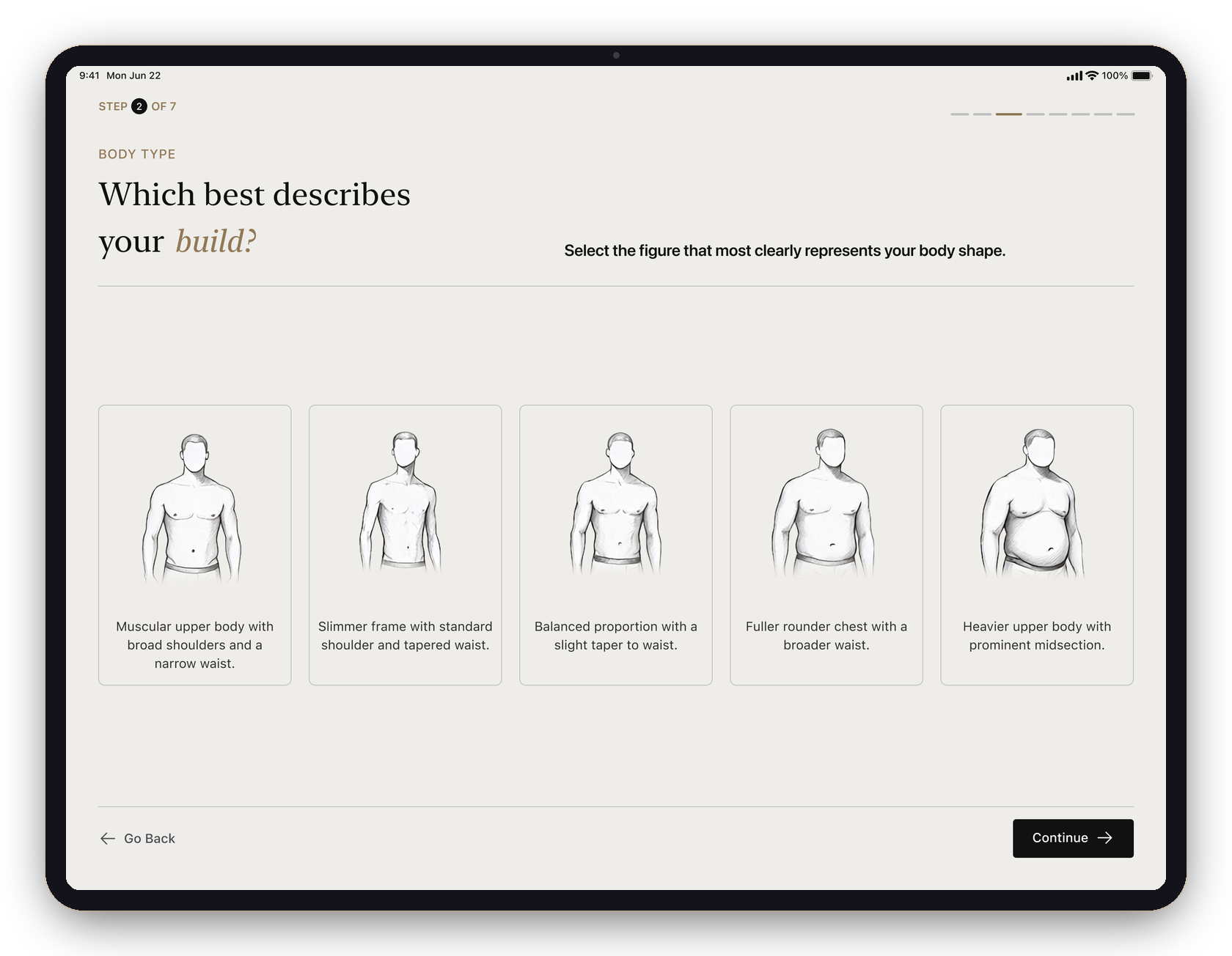
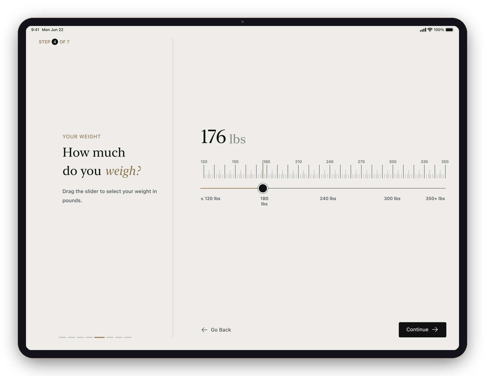
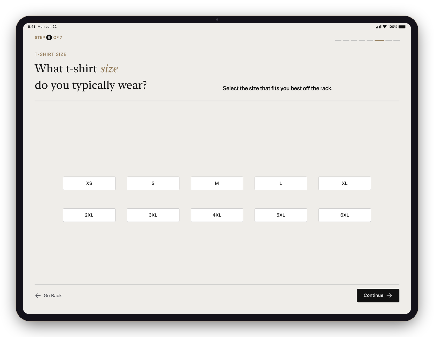
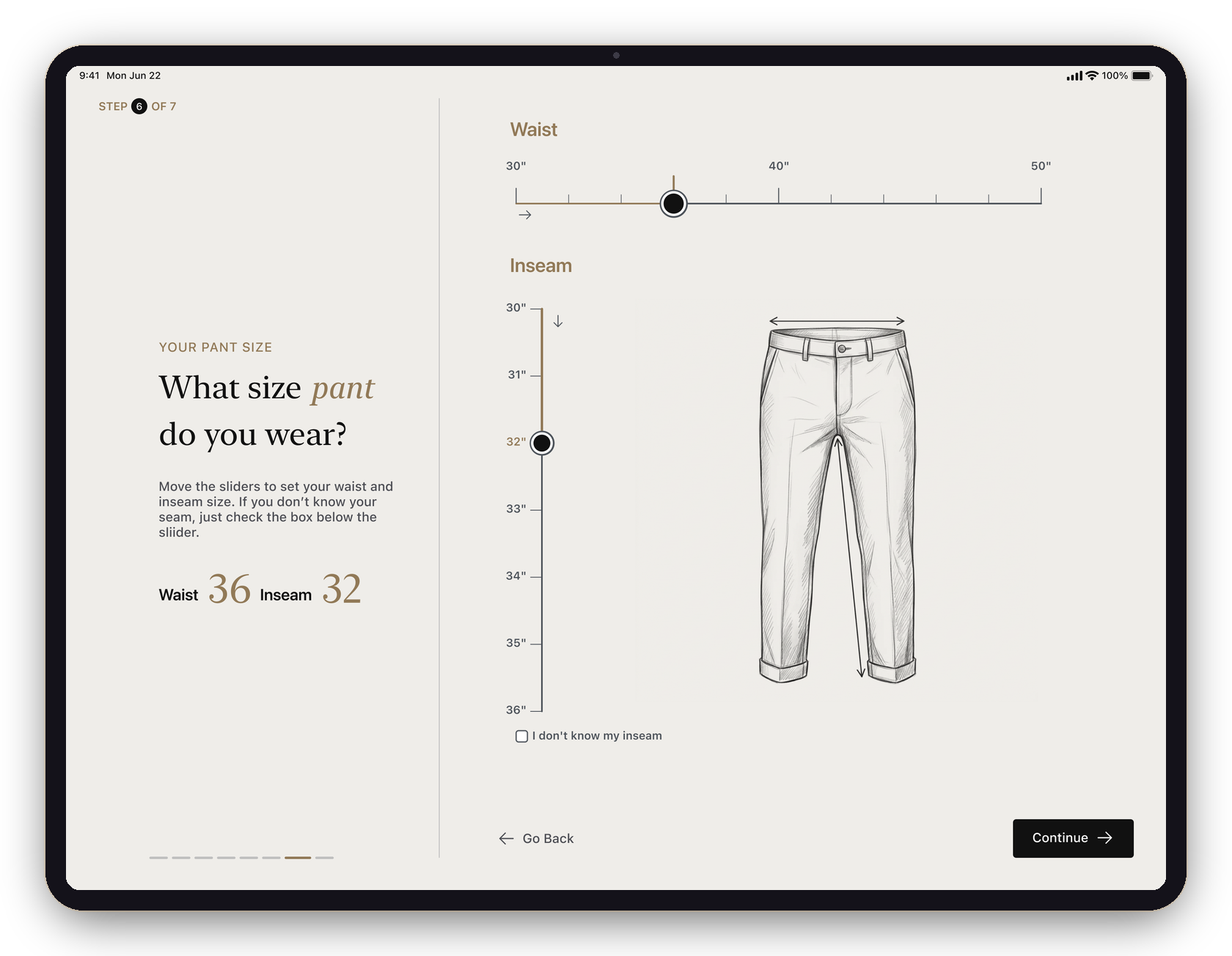
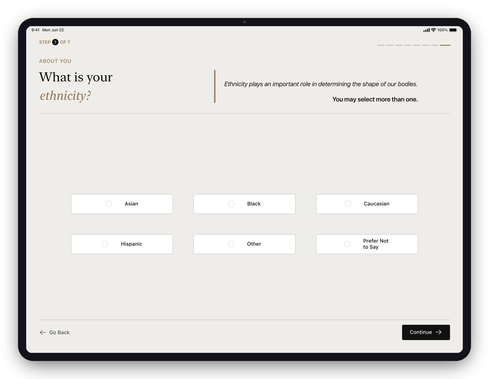
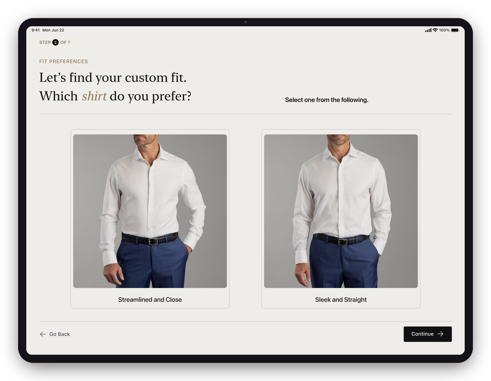
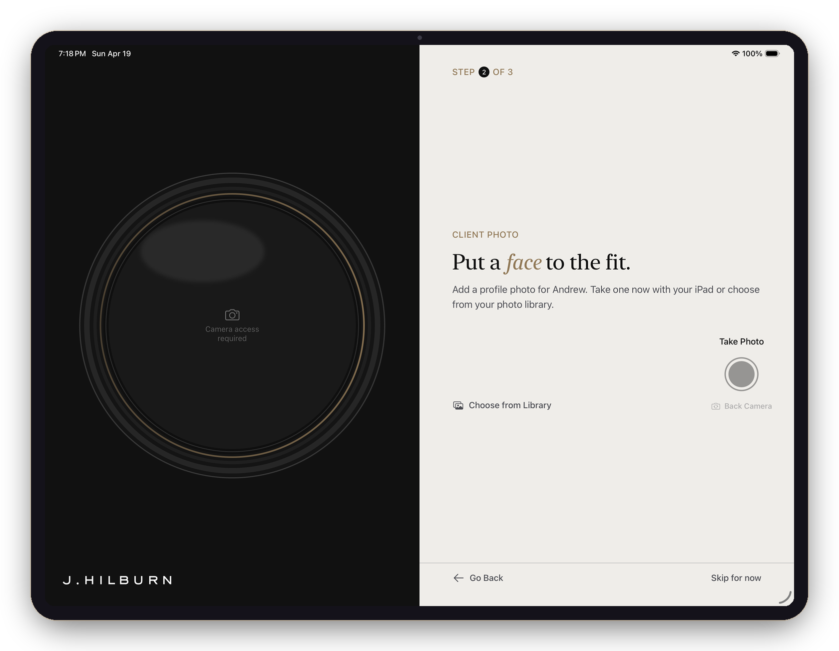
The old survey was a wall of forms and tiny pickers — everything asked at once, before an appointment could even start. I redesigned the whole flow into a calm, one-question-at-a-time experience, with illustrations and real garment photography doing the explaining.
Then I took it past the brief: I built it as a native iOS app — Figma to working Swift, via Claude Code. A rare case of a designer shipping her own work in code.