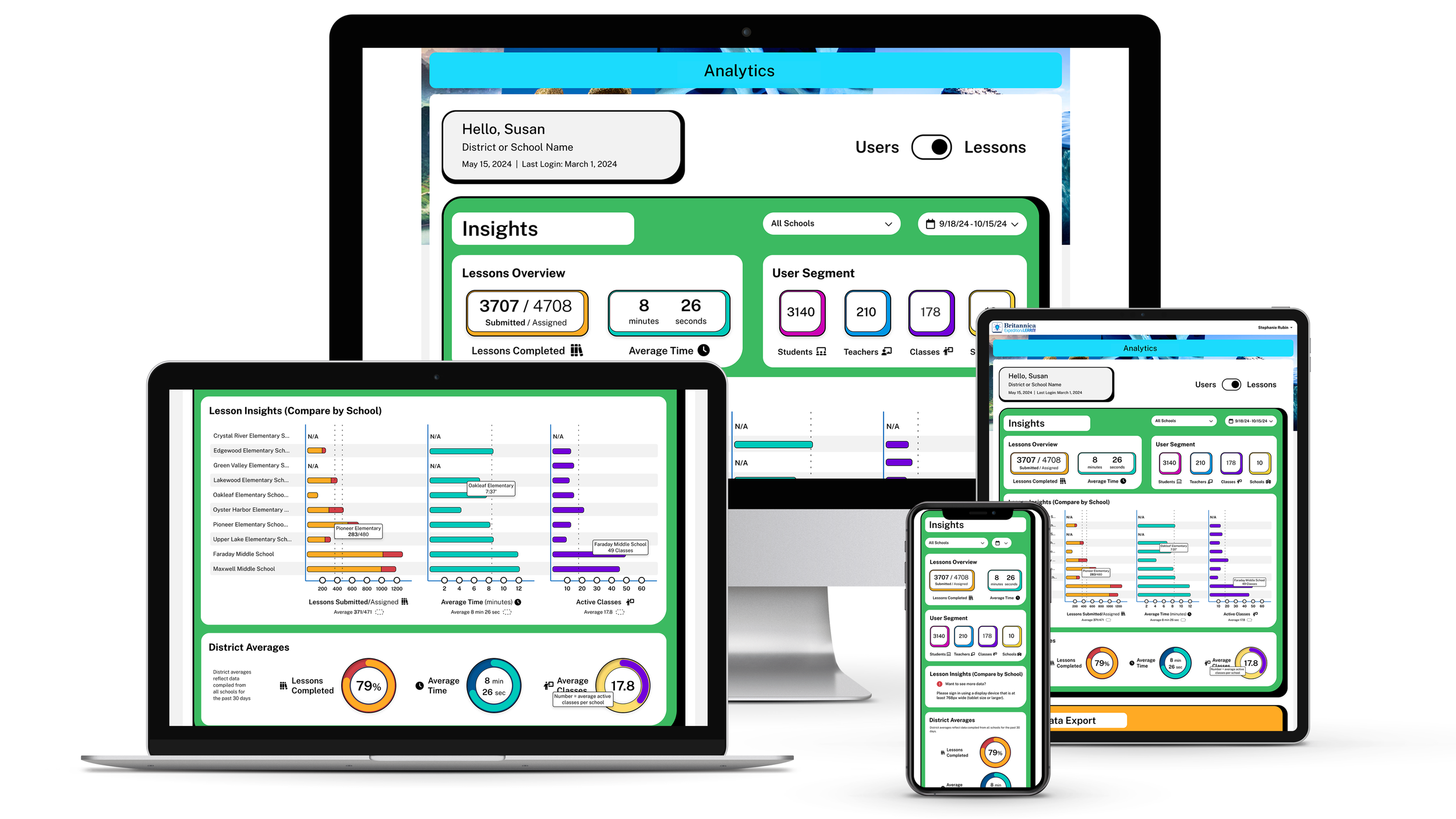
A school-administrator dashboard for an Encyclopedia Britannica EdTech product — usage and performance across schools, teachers, and students. Designed responsively for desktop, laptop, tablet, and phone.
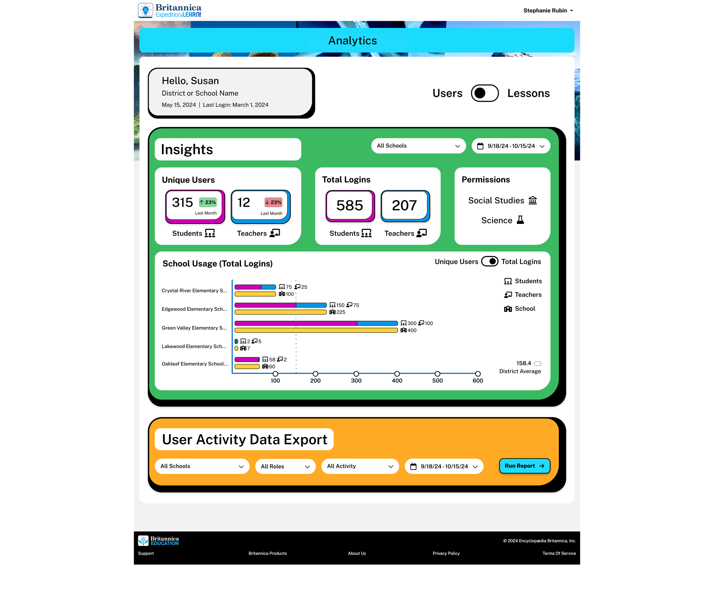
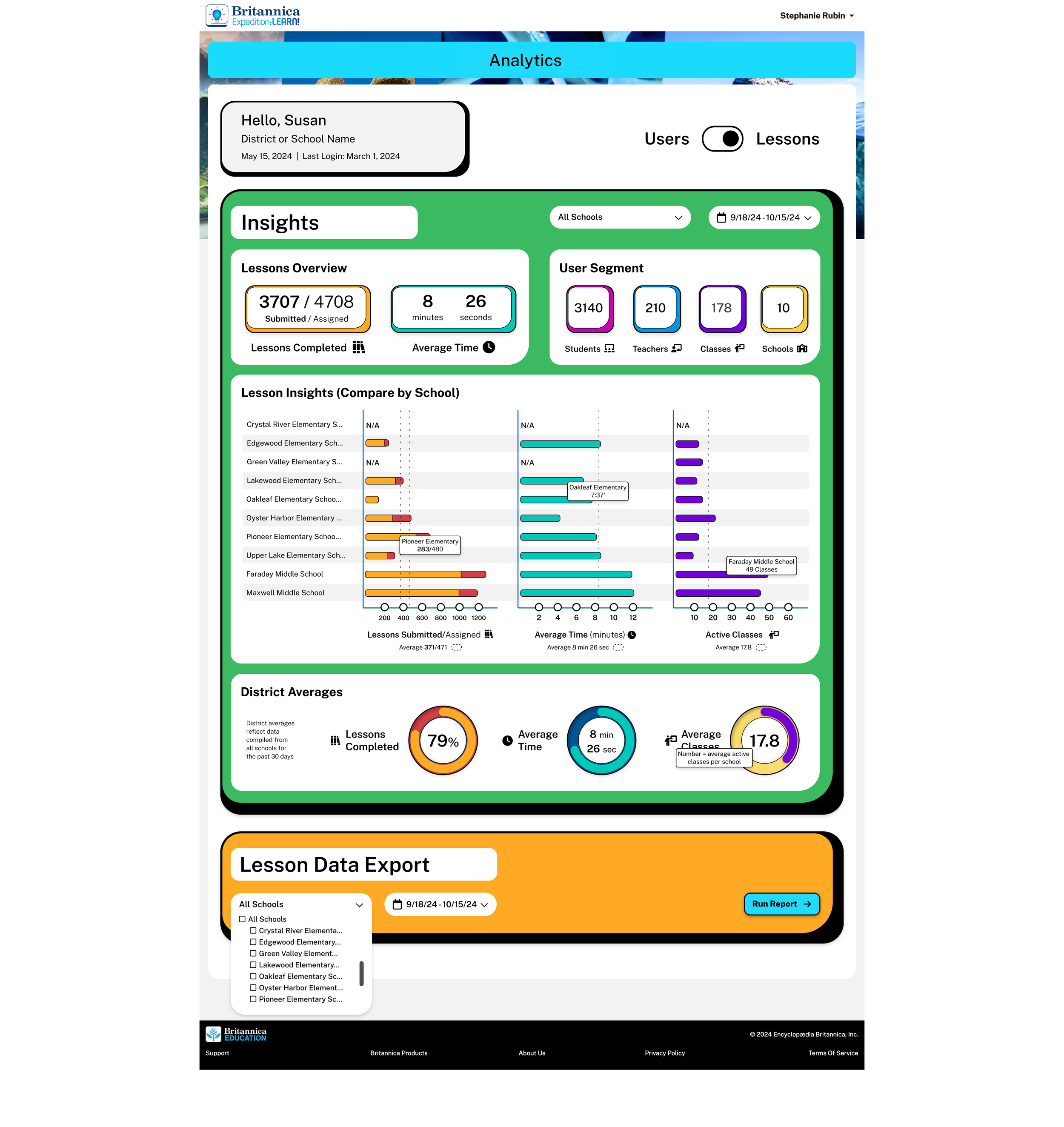
School administrators needed to see usage and performance across their schools, their teachers, and their students — at every level of granularity, on whatever device they happened to be on.
One dashboard, four resolutions, three audiences, and enough flexibility to answer the next question they thought of.
Collaborated with a Project Manager, an SME, and front- and back-end developers. The PM and SME set user goals and some requirements; I led design, direction, and research.
Inputs that shaped the design: user surveys, behavioral data, EdTech competitor research, and a former teacher's lived experience with student data.
Every view answers a question someone in the building actually asks. The dashboard pivots between three audiences without re-orienting the user.
"Beyond user-friendly, beyond innovative — intentionally crafted to support teachers and enhance student learning."
Admins flip between two perspectives on the same data. Users answers "who's logging in?" — Lessons answers "what's getting done?"
Users view —Unique Users · Total Logins · School Usage. Quick-scan KPI cards up top, then a bar chart that lets admins compare schools at a glance, with a category filter (Social Studies / Science) to slice further.
Lessons view —Lessons Overview · User Segment · Lesson Insights · District Averages. The tooltip surfacing minutes-per-school is the kind of detail that turns a chart into a triage tool.
Both views share filters (school, role, date range) and a Data Export so admins can take any slice into their own tools.
Analytics dashboards fail when designers treat data like decoration. Every chart, every percentage, every color choice has to answer the question: "What will an admin do with this number?"
Having graded student work for five years made the difference. I knew that "completion rate" without "average time" is a lie. That "lessons assigned" matters less than "lessons opened." That a heat map of struggling students gets a teacher's attention faster than a table. The dashboard isn't a report — it's a triage tool.