Encyclopedia Britannica · 2024 Proposed redesign

Expedition Learn.

A redesign of Encyclopedia Britannica's K–8 lesson platform — grounded in pedagogy, optimized for the Chromebooks students use, and built around how students really read.

Expedition Learn — Chromebook view
The brief

Eleven pages, five asks.

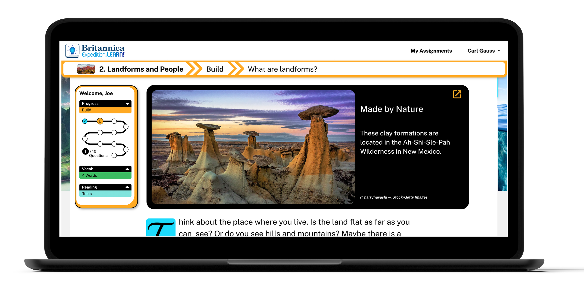
Encyclopedia Britannica's K–8 lesson platform. Each lesson moves through four phases: Spark, Build, Connect, Learn More.

The PM team came with a list — better nav, progress tracker, reading tools, vocab redesign, Chromebook-tuned layout. What they got was more than a punch-list.

My role

Sole UX, former teacher.

Led research, direction, and execution; PM and SME set the targets. Tools were Adobe XD, Photoshop, and a lot of Snagit.

The differentiator: I'd been on the other side of these screens. M.Ed. and five years in the classroom. Every decision tested against what students actually do.

Three decisions

Pedagogy in product form.

  1. Vocabulary as a constant companion.Pinned mini in the side nav — definitions are always one glance away.
  2. Above-the-fold first.Built for the Chromebook viewports schools actually have. Less scroll, more learn.
  3. Skill scaffolding.Tap the skill banner — the lesson teaches Cause & Effect, Vocabulary, Main Idea, in place.

"Beyond user-friendly, beyond innovative — intentionally crafted to support teachers and enhance student learning."

— Design philosophy carried into every screen
04 — The redesign

Eleven pages, nine redesigned.

Each lesson moves through four phases. The redesign signals where you are with phase color: Spark teal, Build orange, Connect green, Learn More red. Watch the lesson go.

Spark · Page 1

Spark video introduces the topic. Vocabulary primed. Open response.Page 01

Build · Pages 2 to 6

Articles, progressively challenging questions, and the first big skill scaffold — vocabulary as a constant companion in the side nav.

Article — "What are landforms?" — Chromebook-tuned scroll length, vocab visible, hoodoos hero.Page 02
Q3 — A Unique LandscapePage 03
US topography mapPage 04
Q5 — extended map usePage 05
Q6 — first skill scaffold appears: Use Vocabulary. DOK1 difficulty.Page 06

Connect · Pages 7 & 10

Feature highlight · Skill scaffolding

At Page 7 the lesson shifts from Build to Connect. Higher-DOK questions arrive — and so does the feature I'm proudest of. Tap the skill banner and the page expands to teach the skill in place. Cause and Effect, Compare and Contrast, Main Idea — whichever the question demands. Struggling students don't get sent off to a help page. The lesson teaches itself.

Page 7 — skill banner collapsedQ7 · DOK2
Same page, skill panel expanded — Cause & Effect taught in line.Q7 · expanded
Q10 — Deep in the Gorge. Dadès Gorge, Morocco. 9 of 10 complete.Page 10

Learn More · Page 11

A real landing pad — Related Lessons, Britannica School, Teach for Britannica. The lesson extends, doesn't dead-end.Page 11
9pages
Of 11 redesigned
7objectives
Met from the brief
2audiences
Students & teachers
1vocabulary system
From sidebar to nav-pinned
05 — Reflection

What I learned.

EdTech doesn't fail because the product is bad. It fails because it forgets what classrooms are actually like — small viewports, distracted kids, teachers triaging twenty things at once. This redesign was an exercise in remembering.

The classroom lens was my unfair advantage — and I'd argue any EdTech team that doesn't have at least one former educator on the design side is leaving learning outcomes on the table. Pedagogy isn't a layer you add later. It's the ground floor.

© 2026 Rebekah Terry — built among the stars
IMAGINE · DESIGN · BUILD